


Project Overview
The Astir, located in Callowhill, PA, offers sophisticated city residences that embody the dynamic energy of their ever-evolving neighborhood while providing a peaceful sanctuary for residents. With the tagline, "Your Pace. Your Place," The Astir bridges the excitement of urban living with the calmness of home, offering a balanced lifestyle for those seeking both vibrancy and tranquility. I was tasked with designing the logo and complete brand identity, including brand guidelines, to visually articulate the essence of this unique community.
Scope of Work
Logo Design
Brand Guidelines
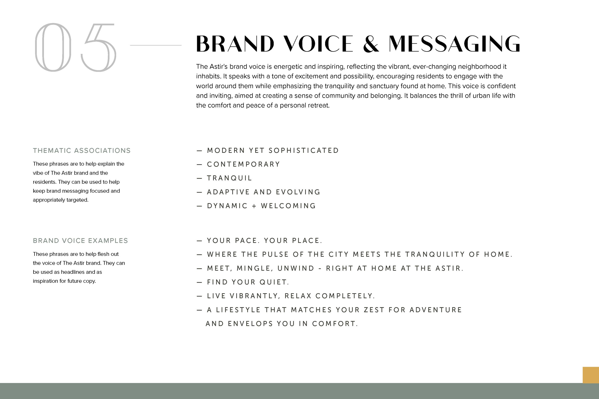
Challenges
Capturing the dual nature of The Astir as a vibrant urban residence and a tranquil retreat in its brand identity.
Developing a logo and design elements that resonate with a diverse demographic, from young professionals to families.
Ensuring the branding stands out in a competitive residential market while maintaining timeless appeal.
Design Solutions
Logo Design:
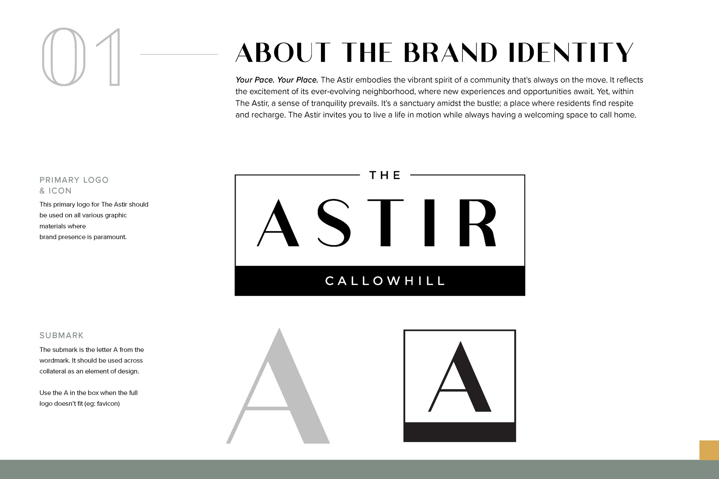
The logo for The Astir mimics the building facade, and the rectangular shape around the name embodies a safe sanctuary for residents in a vibrant yet calming environment.
Typography: Modern sans-serif typography conveys sophistication and clarity while remaining approachable, reflecting The Astir's welcoming yet stylish personality.
Symbolism: The logo features sharp angles inspired by the architecture of the building.
Brand Identity:
The Astir’s brand identity focuses on a harmonious blend of energy and relaxation, reflecting its dual character as a lively and peaceful community.
Color Palette:
A balanced mix of muted calming colors, complemented by a pop of yellow, mirroring the contrast between tranquility and urban vibrancy.Typography System:
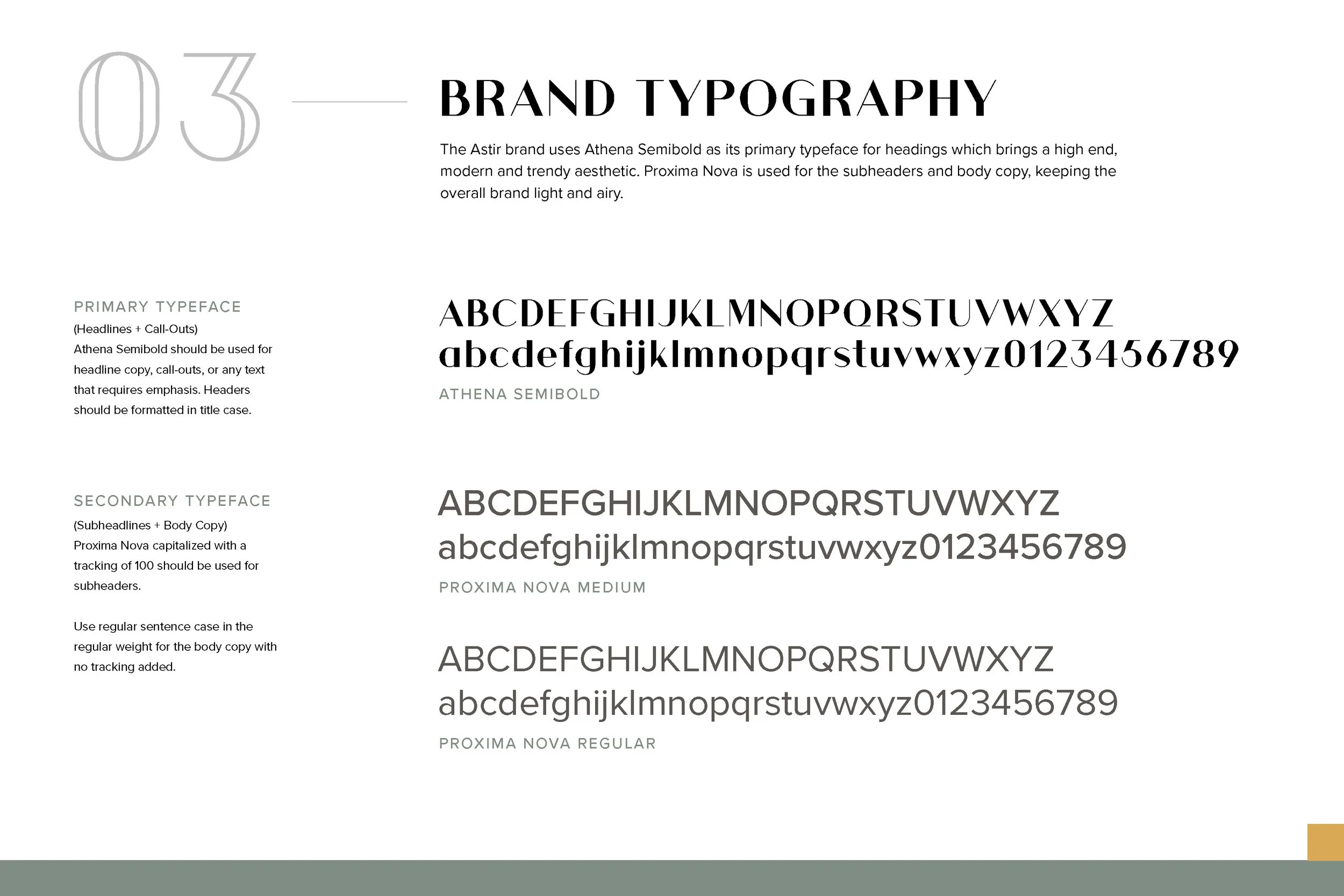
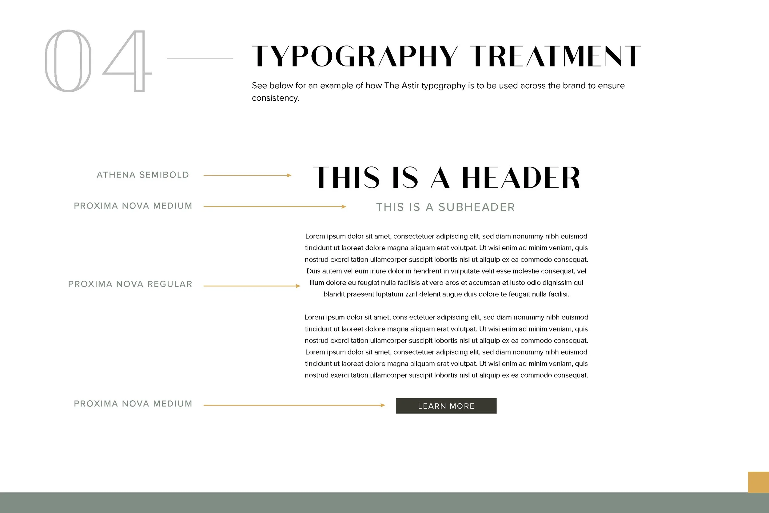
A refined serif font for headlines paired with a clean sans-serif font for body text establishes an approachable and contemporary tone while enhancing readability across all brand applications.Graphic Elements:
Checkered-like patterns and repetitive straight lines are used throughout the brand materials to evoke a sense of motion and balance, and the letter A is used as a submark to tie back to the name.
Brand Guidelines:
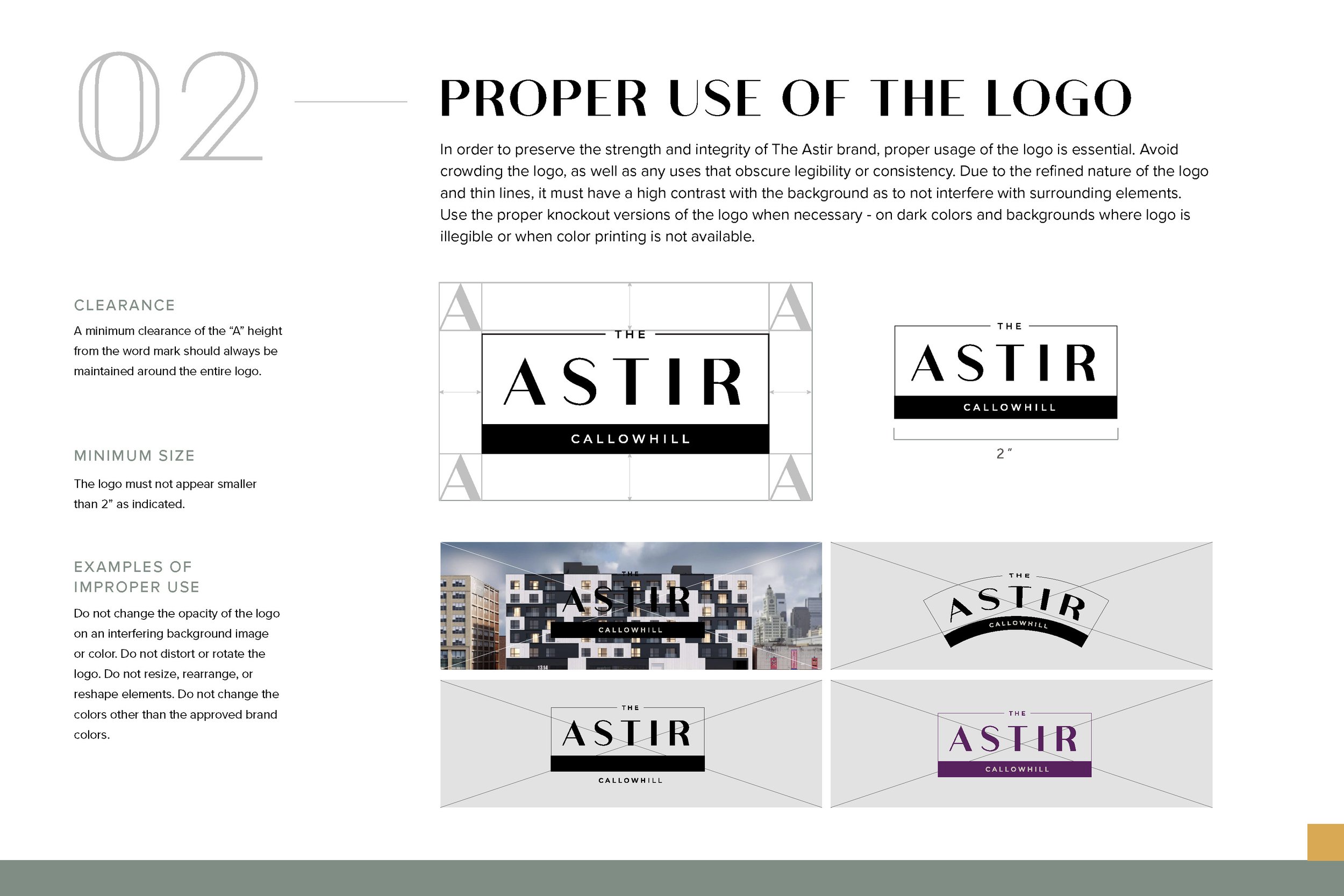
Comprehensive brand guidelines were created to ensure consistency across all touchpoints. These include clear usage instructions for the logo, typography, color palette, and graphic elements, ensuring the brand remains cohesive in all digital and print applications.
Results
The Astir’s branding successfully communicates its core identity as a vibrant yet tranquil community. The modern, cohesive visual language resonates with potential residents, fostering a strong emotional connection to the lifestyle The Astir offers.
Key Outcomes:
A strong and memorable brand presence in the residential market, distinguishing The Astir from competitors.
Increased interest from target demographics drawn by the branding’s clarity and emotional appeal.
A professional and cohesive brand system that supports marketing materials, on-site signage, and digital platforms.
What I Loved About This Project
Designing for The Astir allowed me to explore the duality of movement and calmness, which I found both challenging and rewarding. I enjoyed crafting a brand that bridges the energetic pulse of city life with the serene feeling of home, visually translating the community's ethos. Seeing how the brand elements came together to create a seamless and impactful identity was a highlight of this project.