


Project Overview
The Pavilion on Berry, a modern student housing community in Saint Paul, MN, sought a refreshed brand identity to better reflect its vibrant, youthful, and inclusive environment. As a dynamic hub for students from diverse backgrounds, the property required a logo and brand guidelines that would resonate with its audience and set it apart in a competitive market. I was tasked with reimagining their visual identity to create a cohesive, modern, and welcoming brand.
Scope of Work
Logo Redesign
Brand Guidelines Development
Challenges
Reimagining the logo while maintaining familiarity for current residents and stakeholders.
Creating a brand identity that appeals to a diverse student demographic.
Ensuring the new identity reflects the property’s commitment to community and growth.
Logo Design
Logo Design & Rationale:
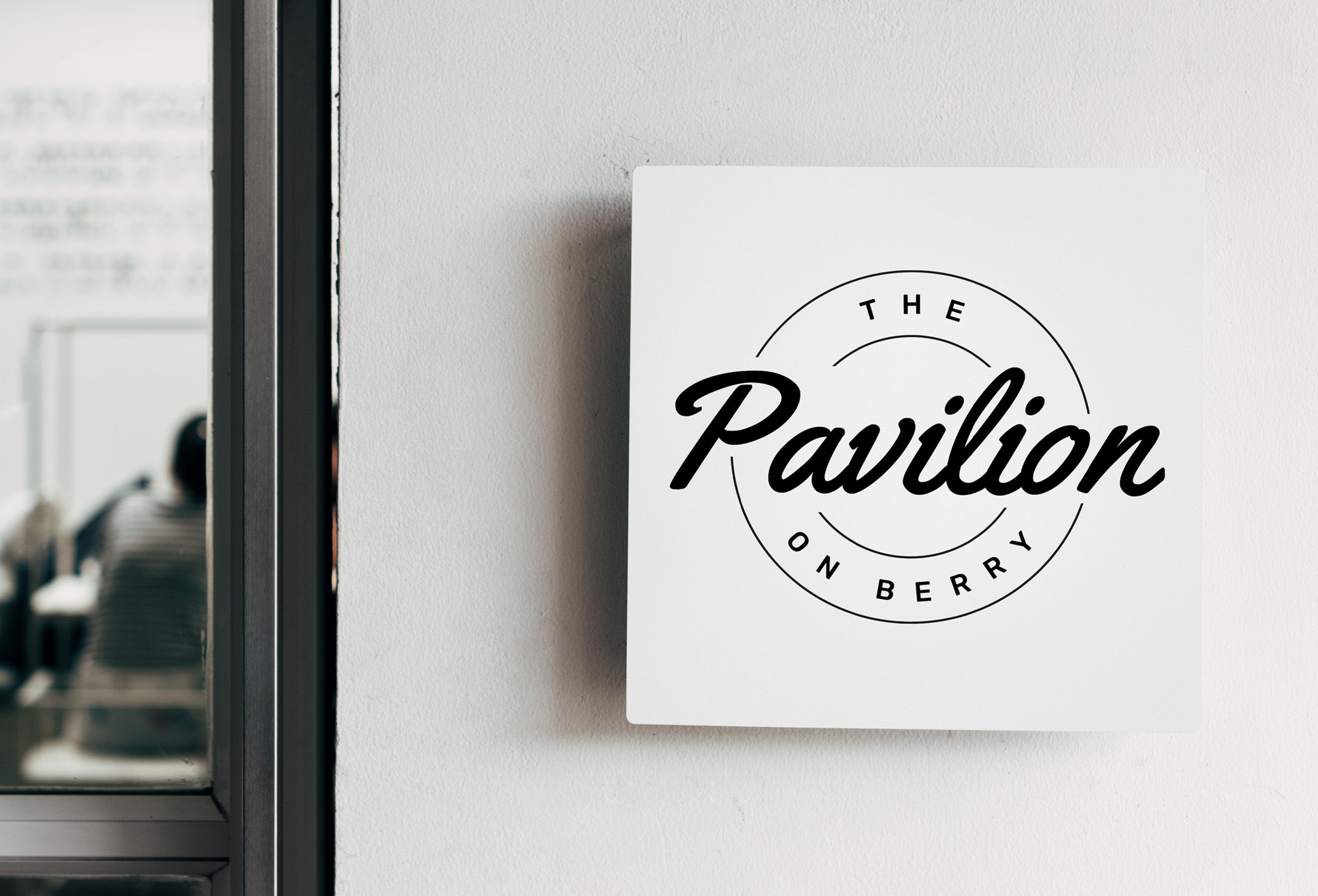
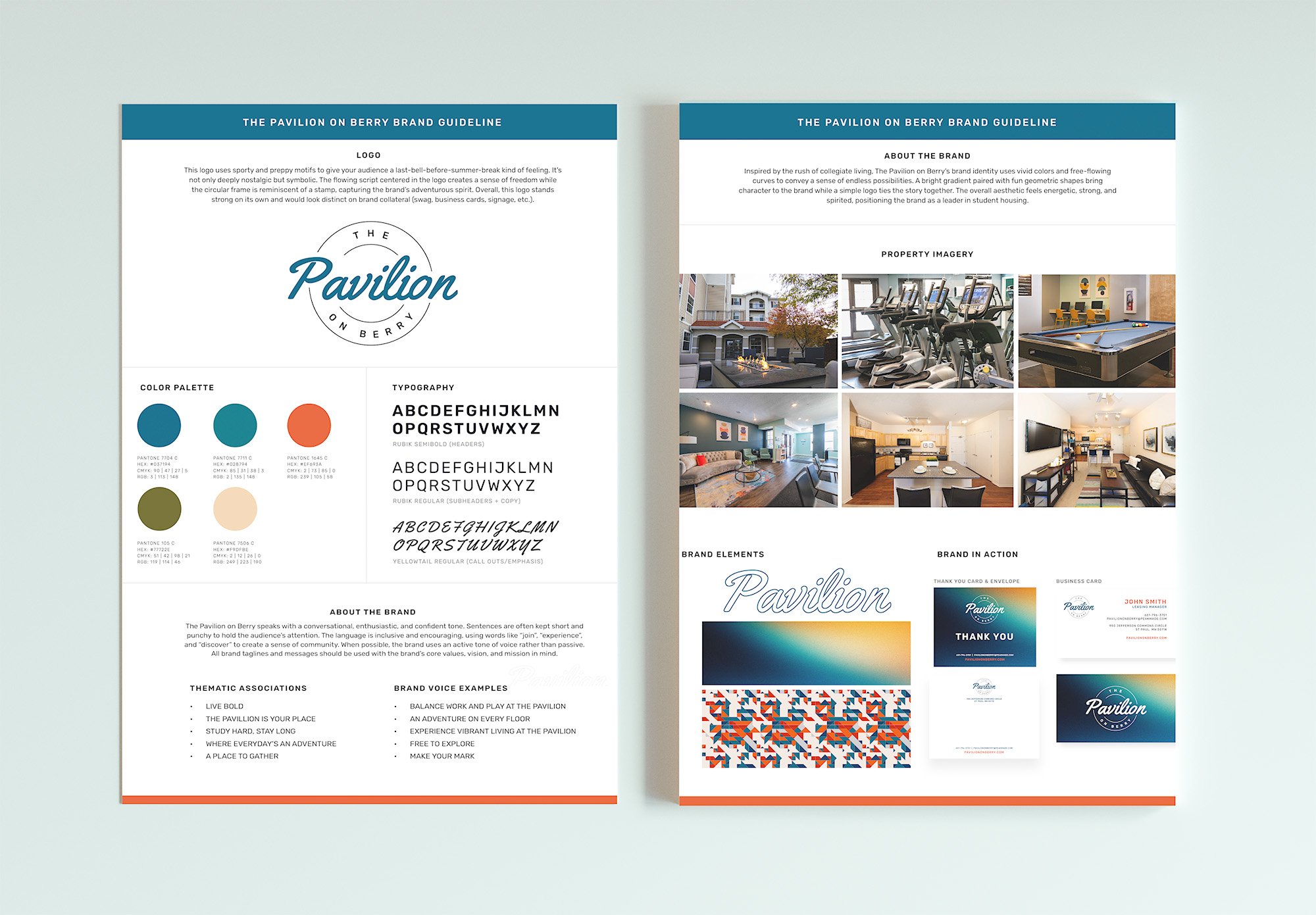
The new logo for The Pavilion on Berry captures the essence of a youthful and vibrant student community while maintaining a polished and sporty look. The design incorporates:
Modern Typography: A mix of clean sans serif and preppy fonts are used to convey a sense of contemporary style and stability.
Symbolism: The flowing script centred in the logo creates a sense of freedom while the circular frame is reminiscent of a stamp, capturing the brand’s adventurous spirit. Overall it stands strong on its own and would distinct on brand collateral.
Color Palette: A dynamic combination of fresh blues and greens paired with neutral grays, reflecting both energy and reliability.
Brand Guidelines:
The brand guidelines were designed to ensure consistency across all touchpoints, from digital platforms to physical signage. Key elements include:
Typography: A versatile type system featuring a modern sans-serif for headlines and a complementary serif for body text, balancing modernity with approachability.
Color Palette:
Fresh Blues/Teals: Evoking trust, energy, and vibrancy.
Green: Symbolizing growth and inclusivity.
Orange: Adding energy and a pop of color.
Design Elements: Subtle graphic patterns inspired by architectural details of the property, adding texture and visual interest to the brand’s materials paired with a bright gradient of blue, orange and yellow to balance the geometric pattern.
Results
The rebrand successfully reinvigorated The Pavilion on Berry’s identity, aligning it with the property’s mission and target audience.
Key Outcomes:
A modern, vibrant logo that resonates with students and stakeholders alike.
A comprehensive brand guideline that provides consistency across all marketing and operational materials.
Positive feedback from residents and increased interest from prospective tenants.
What I Loved About This Project
Rebranding The Pavilion on Berry was a journey of blending creativity with strategy. I loved the challenge of designing a logo that felt fresh and youthful while maintaining a sense of trust and professionalism. Crafting the brand guidelines allowed me to dive deep into creating a cohesive visual language that tells the story of community and growth. Knowing this rebrand would play a role in shaping students’ experiences during such a transformative time in their lives made this project truly rewarding.