

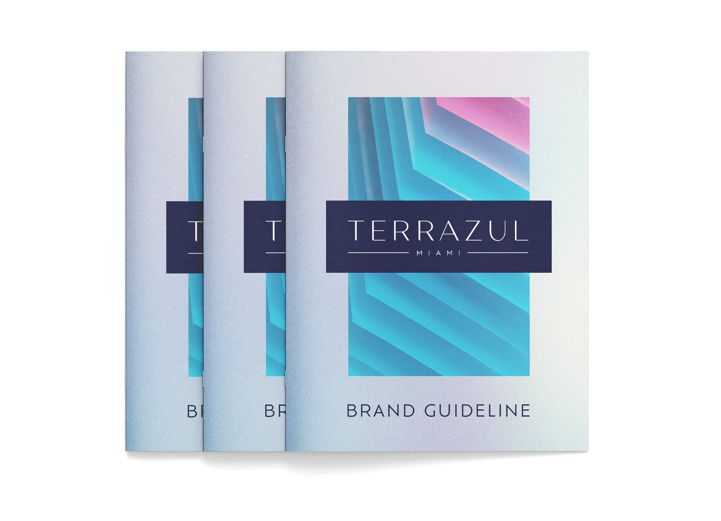


Project Overview
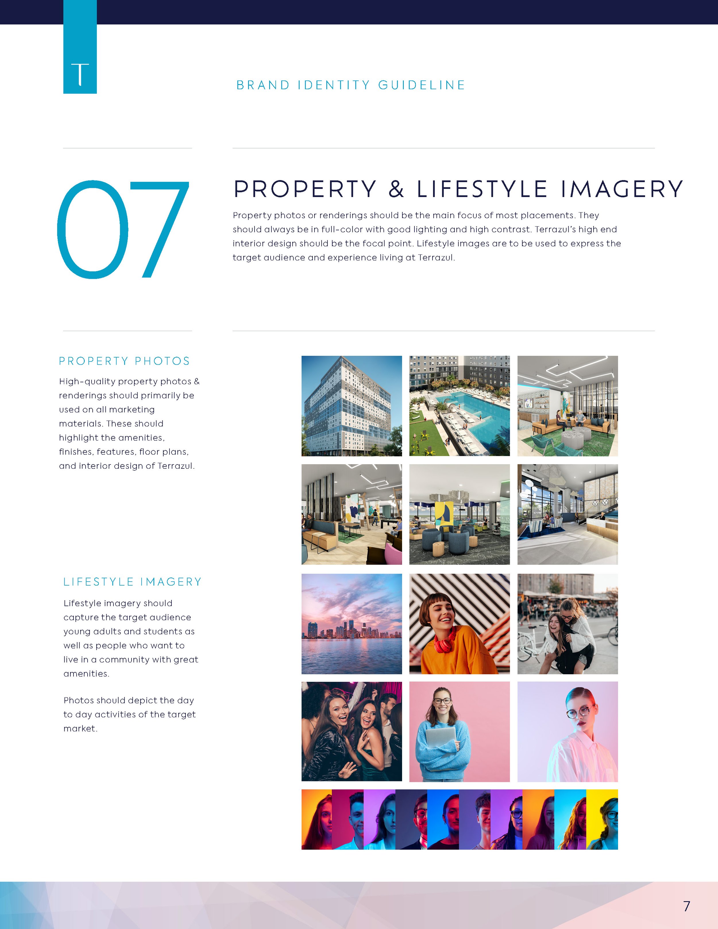
Terrazul Miami brings a new standard of student living to Florida International University (FIU) students. Located just seconds from campus, this fully furnished student housing community combines convenience with an elevated lifestyle. Boasting a top-tier amenity deck with a pool and outdoor lounge spaces, Terrazul offers a vibrant and memorable environment for students outside of class.
The brand is deeply rooted in the FIU culture, with “Azul,” meaning blue in Spanish, serving as a nod to camaraderie and unity among students. The sophisticated yet energetic application of blue throughout the branding draws inspiration from Miami’s coastal vibe, creating a perfect blend of refinement and fun energy. My role included designing the logo, comprehensive brand guidelines, and leasing space, ensuring a cohesive and visually striking brand identity.
Scope of Work
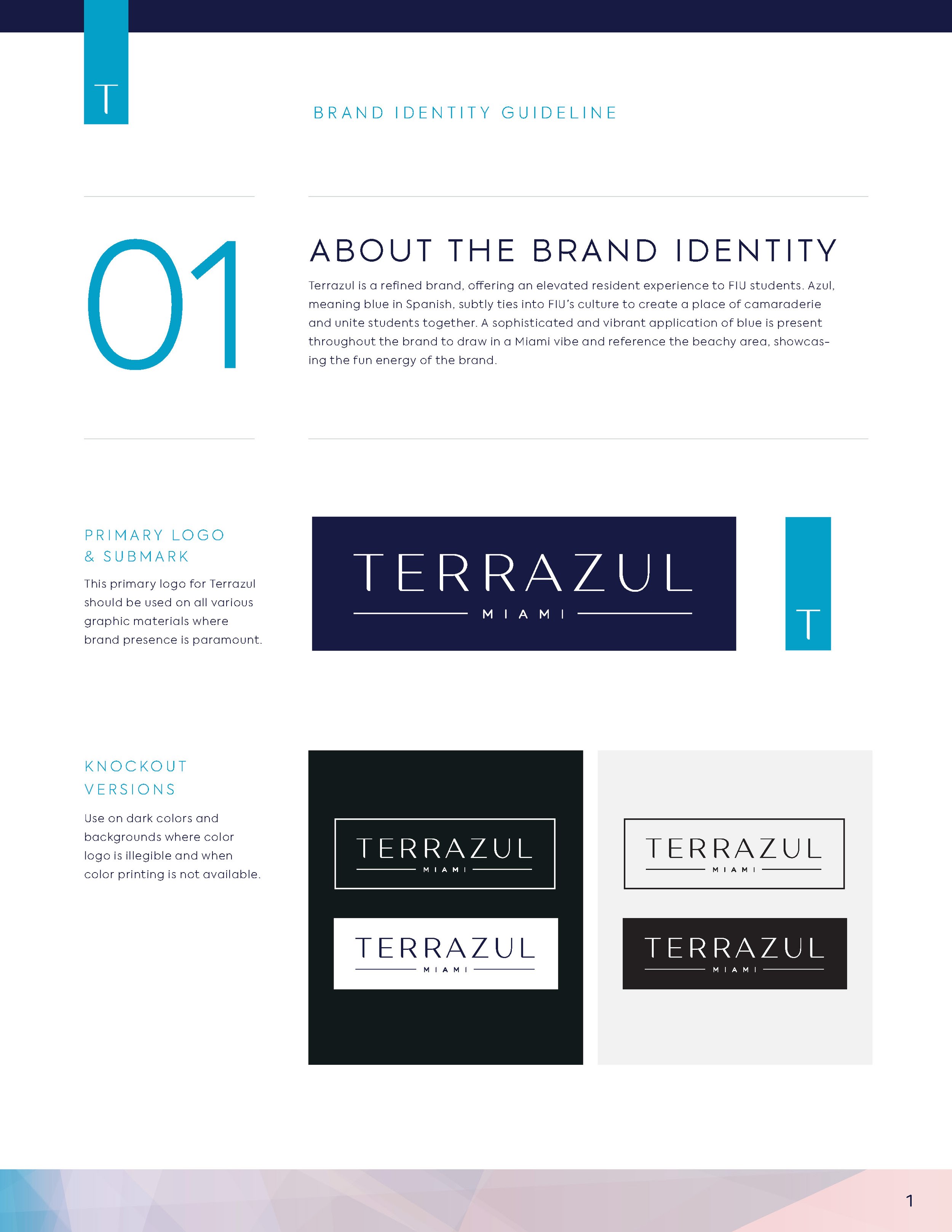
Logo Design
Brand Guidelines
Leasing Space Design
Challenges
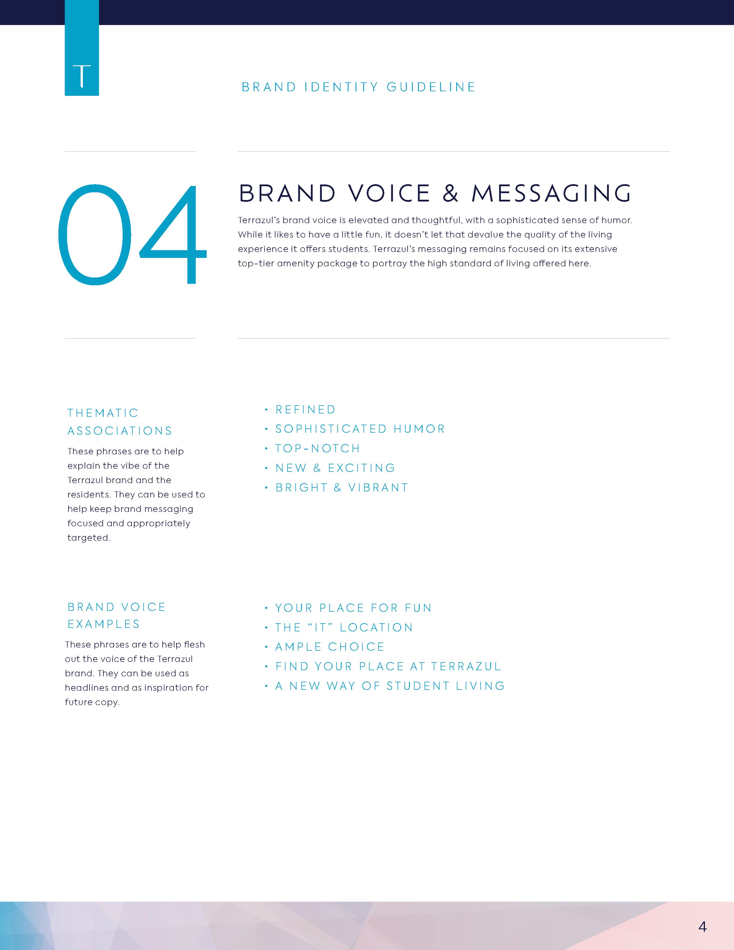
Balancing sophistication with the vibrant, youthful energy of Miami’s student life.
Ensuring the branding resonates with both FIU students and their families.
Designing a leasing space that aligns with the brand’s coastal-inspired identity while offering functionality.
Design Solutions
Logo Design:
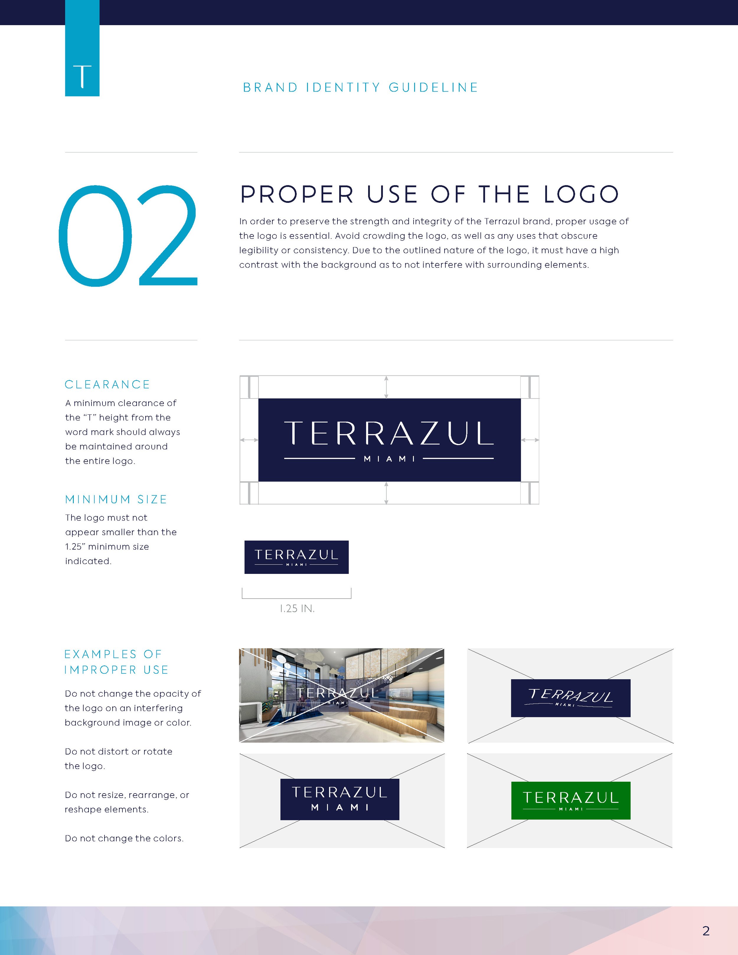
The logo captures the spirit of Terrazul with a clean, contemporary design that reflects the energetic and refined nature of the brand.
Typography: Sleek sans-serif typography conveys sophistication while maintaining a youthful, approachable tone. The geometric word mark is strong and recognizable across all collateral.
Brand Guidelines:
Comprehensive brand guidelines were developed to maintain consistency and a unified identity across all applications.
Color Palette:
A range of energetic colors are used to represent the “Azul” concept, tied to FIU’s culture and the beachy atmosphere of Miami.
Accent colors include vibrant pinks and orange, reflecting the energy and vibrancy of student life and Miami’s lively aesthetic.
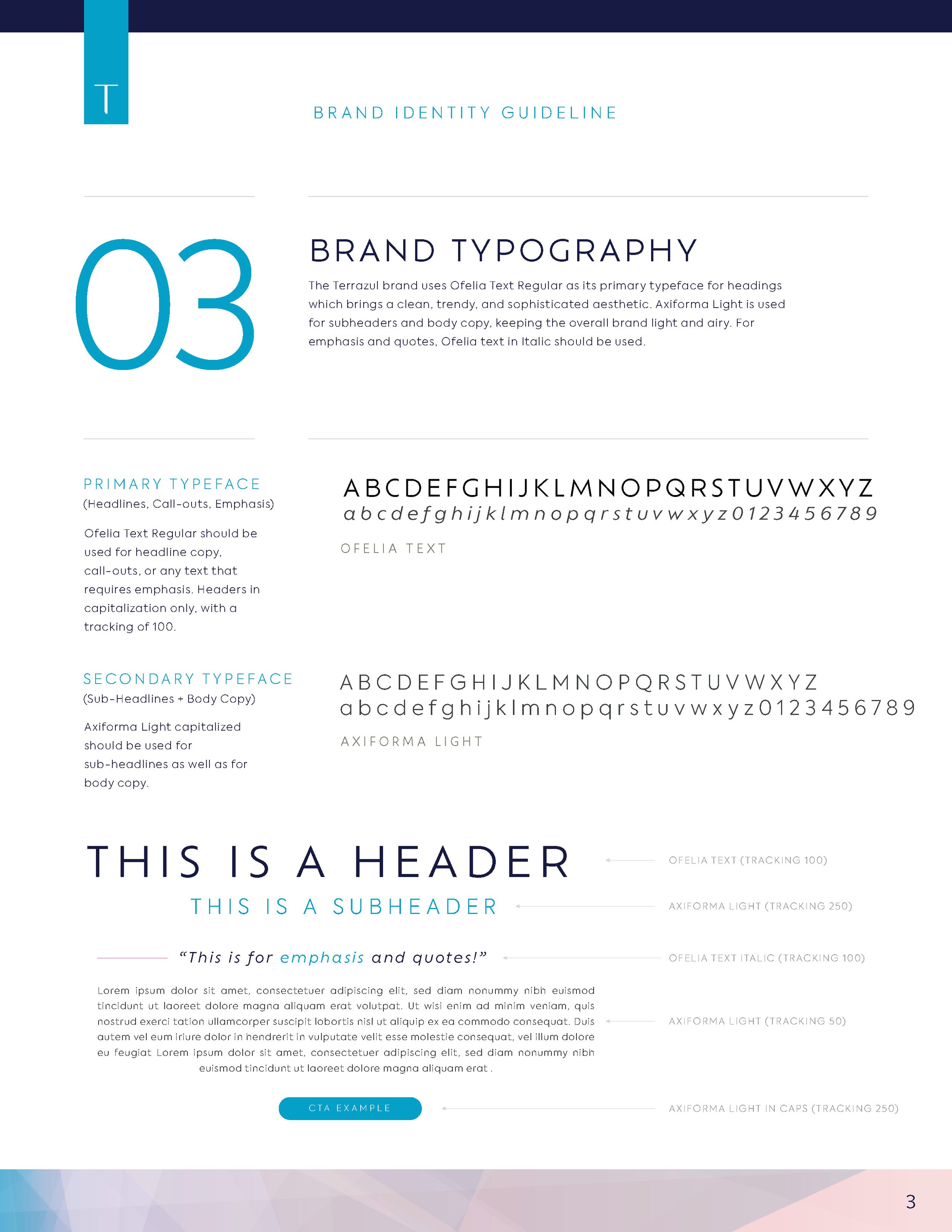
Typography System:
A modern sans-serif font for headlines conveys clarity and sophistication.
A friendly secondary sans-serif typeface adds warmth and approachability, perfect for student-centered messaging.
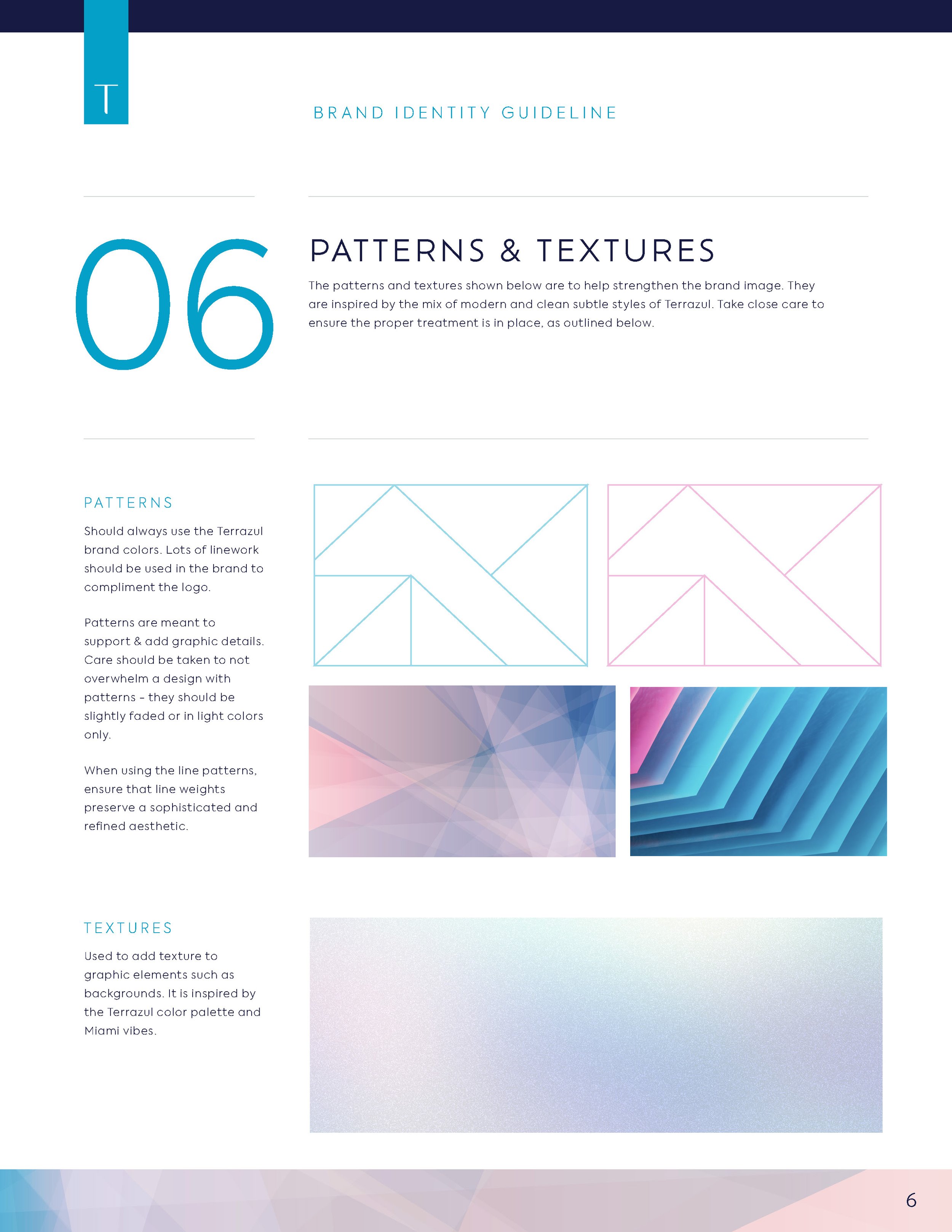
Graphic Elements:
Geometric and sharp patterns are woven throughout the brand to tie back to the logo’s strong lines.
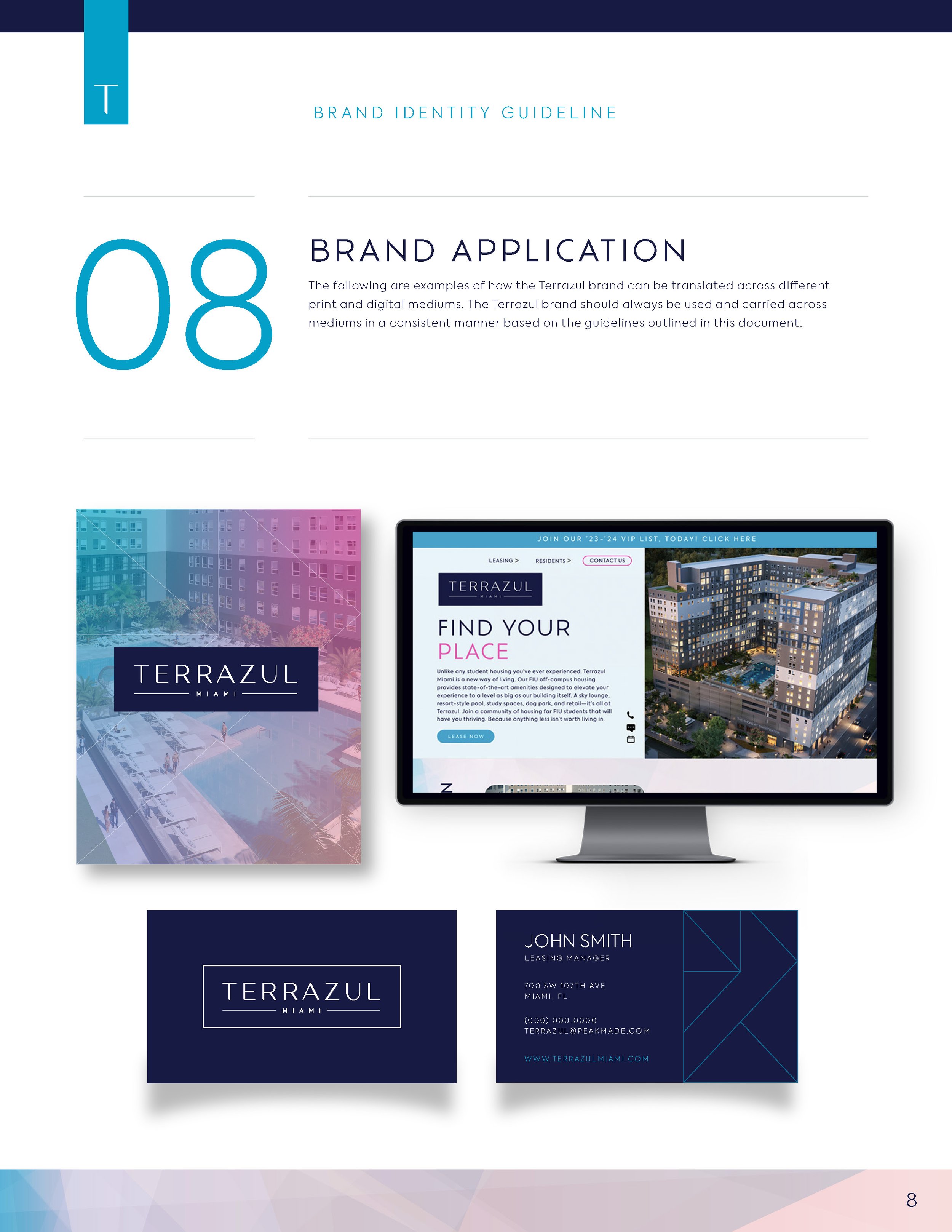
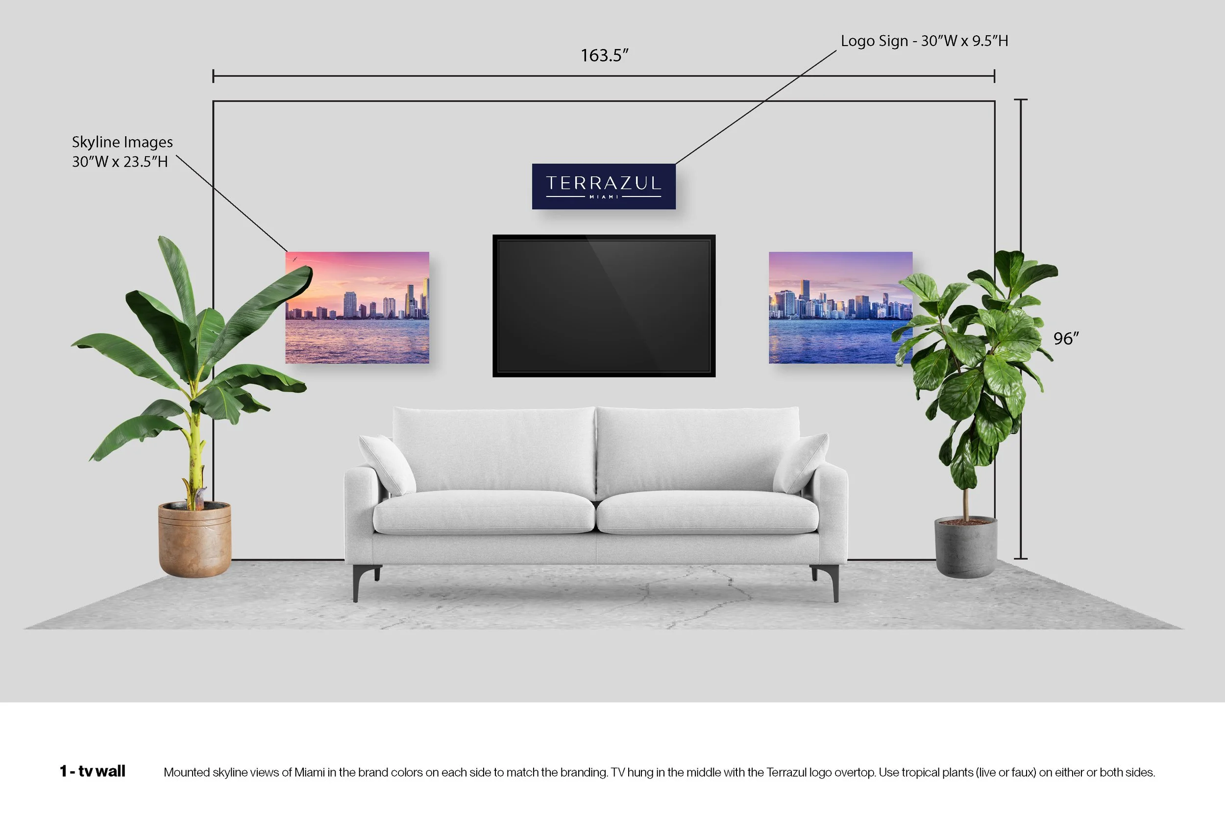
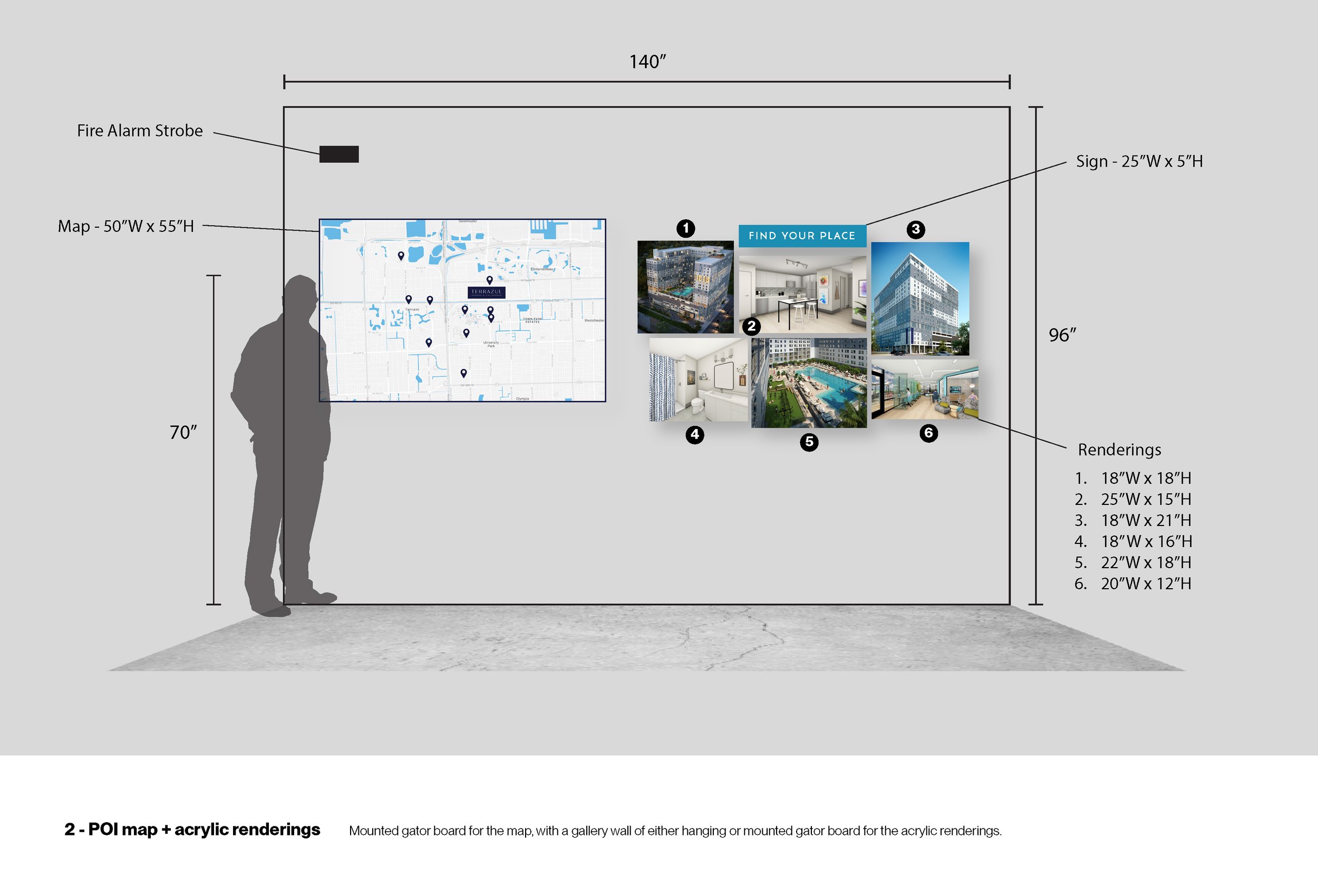
Leasing Space Design:
The leasing space design serves as a physical extension of Terrazul’s brand, combining functional elements with a welcoming and stylish environment.
Branded Interiors: The vibrant color palette, logo, and graphic elements are seamlessly integrated into wall graphics, signage, and decor.
Community-Centric Design: Comfortable lounge areas, interactive screens for virtual tours, and branded materials create an inviting experience for prospective residents.
Miami Energy: The space reflects the essence of Miami’s vibrancy and culture, offering an engaging and memorable environment.
Results
The Terrazul branding successfully communicates its elevated yet fun approach to student living, creating a strong connection with its target demographic. The cohesive visual language enhances the resident experience and positions Terrazul as a premier choice for FIU student housing.
Key Outcomes:
A polished and memorable brand identity that appeals to students seeking an elevated lifestyle near campus.
A leasing space design that reinforces the brand’s refined yet vibrant personality, fostering excitement and confidence among prospective tenants.
Positive reception from students and parents alike, with the branding elevating Terrazul in a competitive student housing market.
What I Loved About This Project
Designing for Terrazul Miami allowed me to combine sophistication and vibrancy, capturing the unique energy of Miami and FIU’s student culture. I especially enjoyed incorporating bright colors elements into the brand’s design and creating a physical leasing space that felt like an extension of the brand itself. Helping craft a memorable and cohesive brand identity that truly resonated with its audience was a rewarding experience.