


Project Overview
Ora Developments is a family-founded homebuilding company rooted in the Sunshine Coast, dedicated to creating modern, thoughtfully designed family homes in East Vancouver. Brothers Colin and Jordan Pope draw inspiration from their upbringing and family tradition of homebuilding to develop homes that prioritize architectural interest, liveability, and community growth.
I had the opportunity to craft Ora Developments’ logo, brand guidelines, a visually engaging brand deck, and stationery. The goal was to create a brand identity that reflects Ora’s dedication to thoughtful design, family values, and modern craftsmanship while resonating with homeowners and the local community.
Scope of Work
Logo Design
Brand Guidelines
Brand Deck Design
Stationery Design
Challenges
Balancing the warmth and family-oriented values of Ora Developments with its emphasis on architectural precision and modernity.
Designing a cohesive identity that appeals to both homeowners and the local East Vancouver community.
Ensuring the brand deck and stationery exude professionalism while remaining approachable and reflective of Ora’s story.
Design Solutions
Logo Design:
The Ora Developments logo embodies the company’s focus on thoughtful design and modern family living.
Symbolism: The logo incorporates clean, geometric lines to evoke a sense of structure, stability, and architectural precision.
Typography: A contemporary sans serif typeface conveys sophistication, while its approachable design reflects the brand’s connection to family and community. The bold black lettering gives a good contrast with the headers being in uppercase to evoke confidence.
Color Palette: The unique gradient graphic element of brand colours (orange, pink & white tones) brings energy, playfulness and freshness while contrasting with the black name Ora.
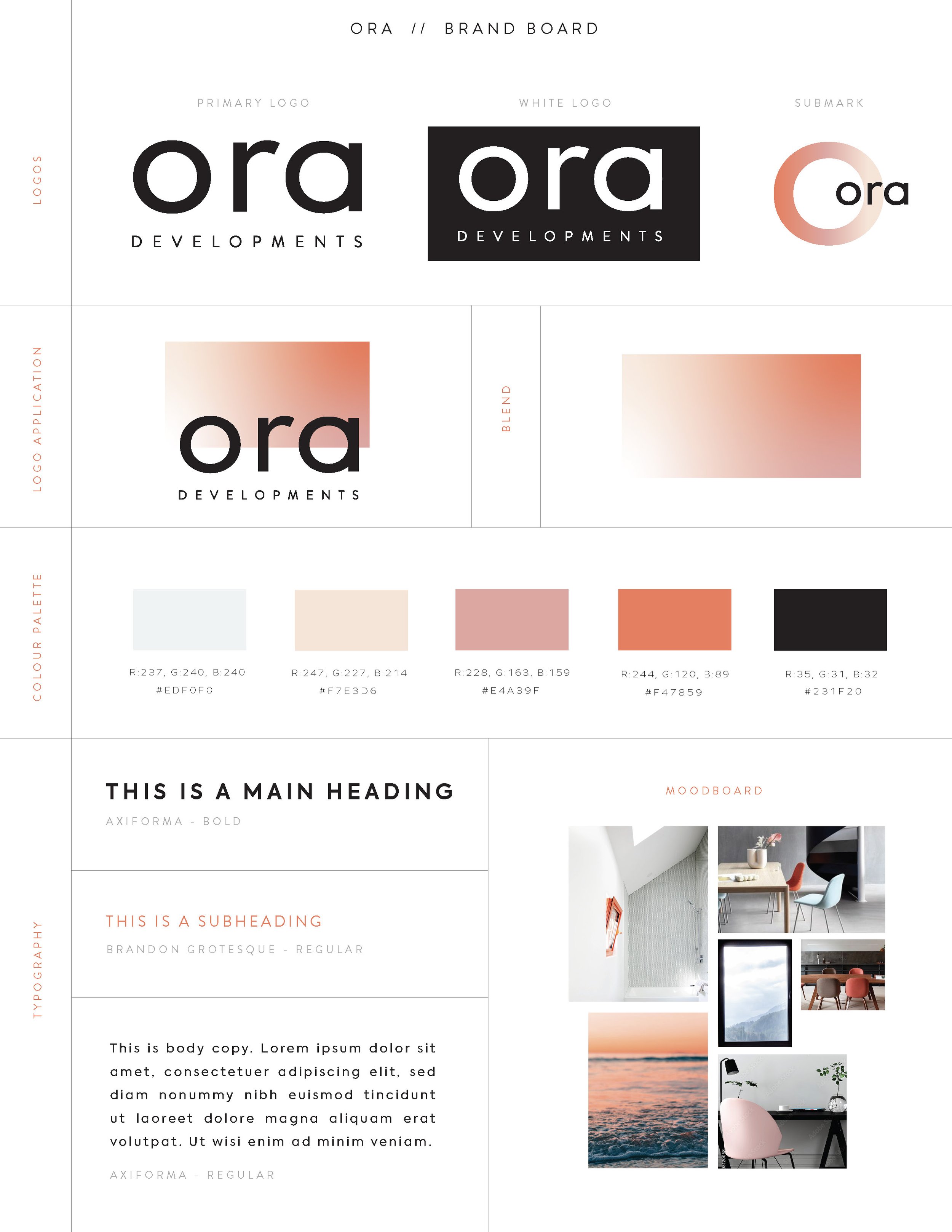
Brand Guidelines:
A comprehensive set of brand guidelines ensures that Ora Developments’ identity is consistently represented across all platforms.
Logo Usage: Clear instructions for logo placement, spacing, and color variations for different applications.
Color Palette: A versatile yet harmonious palette that aligns with Ora’s values and enhances its visual appeal.
Typography System: A modern serif for headlines and a clean sans-serif for body text, balancing elegance with readability.
Imagery and Graphics: Guidelines for showcasing Ora’s homes and projects with visuals that highlight thoughtful design and family living.
Gradient Graphic Element: The unique gradient graphic element of brand colours (orange, pink & white tones) brings energy, playfulness, and freshness to the brand while the overall aesthetic remains minimalist with a focus on the white negative space balanced with the bold black lettering of the logo and clean typography.
Monochrome Imagery: Throughout marketing materials such as the social media feed, the brand could incorporate monochrome (black and white) imagery which works well with the gradient and could provide consistency across different project imagery.
Brand Deck Design:
The brand deck was designed as a polished and professional presentation tool for Ora Developments to showcase its logo application, color palette, and typography on one page.
Structure: A clean layout with a balance of visuals and text to tell Ora’s story effectively.
Visual Elements: Integration of the logo, color palette, and typography to maintain a cohesive and professional look.
Messaging: Emphasis on Ora’s mission to build homes that inspire connection, growth, and community.
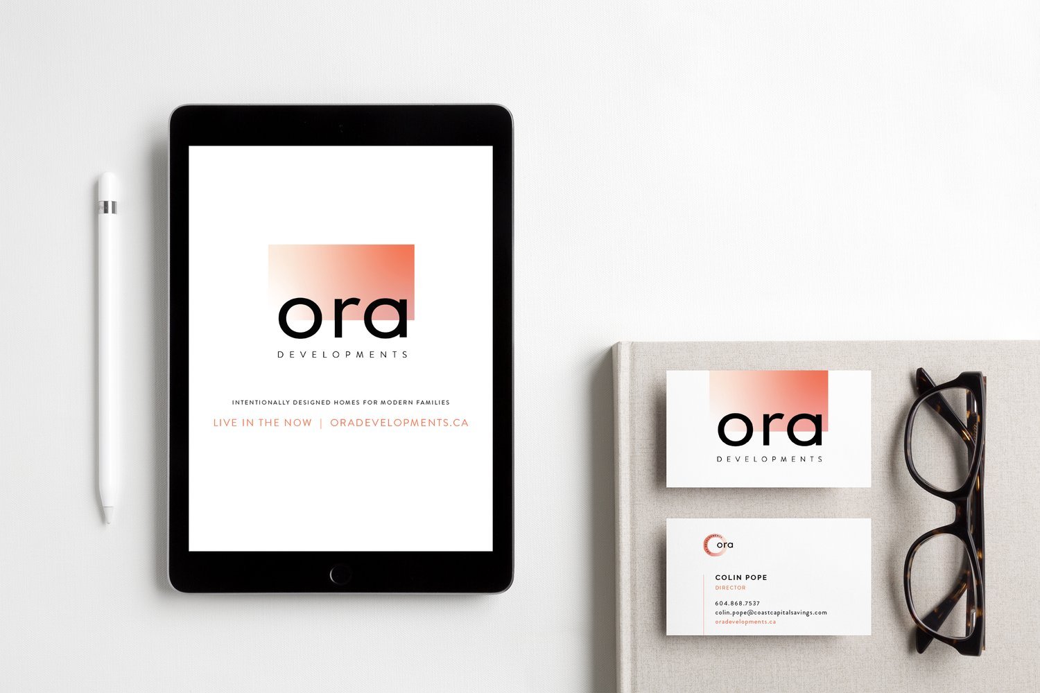
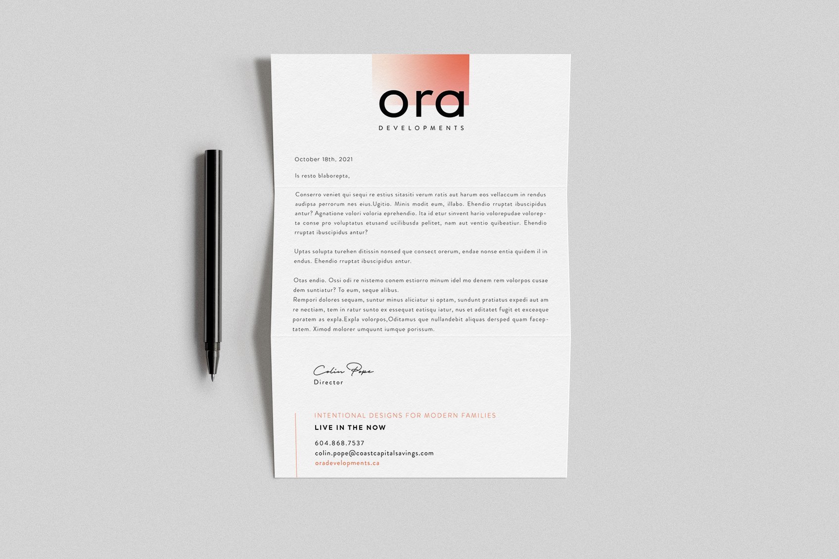
Stationery Design:
The stationery suite was created to reinforce Ora Developments’ brand identity in every interaction.
Business Cards: Elegant yet approachable, featuring the logo prominently and brand colors for a modern and minimalist look.
Letterhead and Envelopes: Minimalist and professional designs with consistent branding elements.
Notecards: Thoughtfully branded for personalized communication.
Results
The Ora Developments brand identity successfully communicates its mission of creating modern family homes rooted in thoughtful design and community. The cohesive visual identity enhances the company’s credibility and appeal to its target audience.
Key Outcomes:
A memorable logo that reflects Ora’s values of family, design, and community.
Brand guidelines that provide a strong foundation for consistent and professional representation.
A polished brand deck that effectively communicates Ora’s story and vision.
Stationery that reinforces Ora’s identity at every touchpoint.
What I Loved About This Project
Working with Ora Developments allowed me to blend my passion for storytelling and design with a meaningful mission. I loved creating a brand identity that not only reflects Ora’s roots and family values but also elevates its vision of modern, thoughtful homebuilding. It was rewarding to design for a company that’s deeply connected to its community and focused on creating lasting impacts through its homes.