


Project Overview
RAI is a residential brand located in Seattle, WA, inspired by the transformative Light Rail System expansion connecting Federal Way to the greater Seattle area. The brand embodies the energy, optimism, and connectivity symbolized by a ray of light, representing a haven for residents who seek to shine bright in this vibrant destination city.
I was tasked with designing the logo, creating comprehensive brand guidelines, and crafting stationery to bring RAI’s vision to life. The goal was to create a brand identity that radiates warmth, energy, and new beginnings while staying rooted in the dynamic urban lifestyle of Seattle.
Scope of Work
Logo Design
Brand Guidelines
Stationery Design
Challenges
Translating the abstract concept of light and connectivity into a tangible and cohesive brand identity.
Balancing urban energy with a sense of warmth and belonging to appeal to a diverse audience of Seattle residents.
Ensuring the brand stood out while harmonizing with Seattle’s unique culture and lifestyle.
Design Solutions
Logo Design:
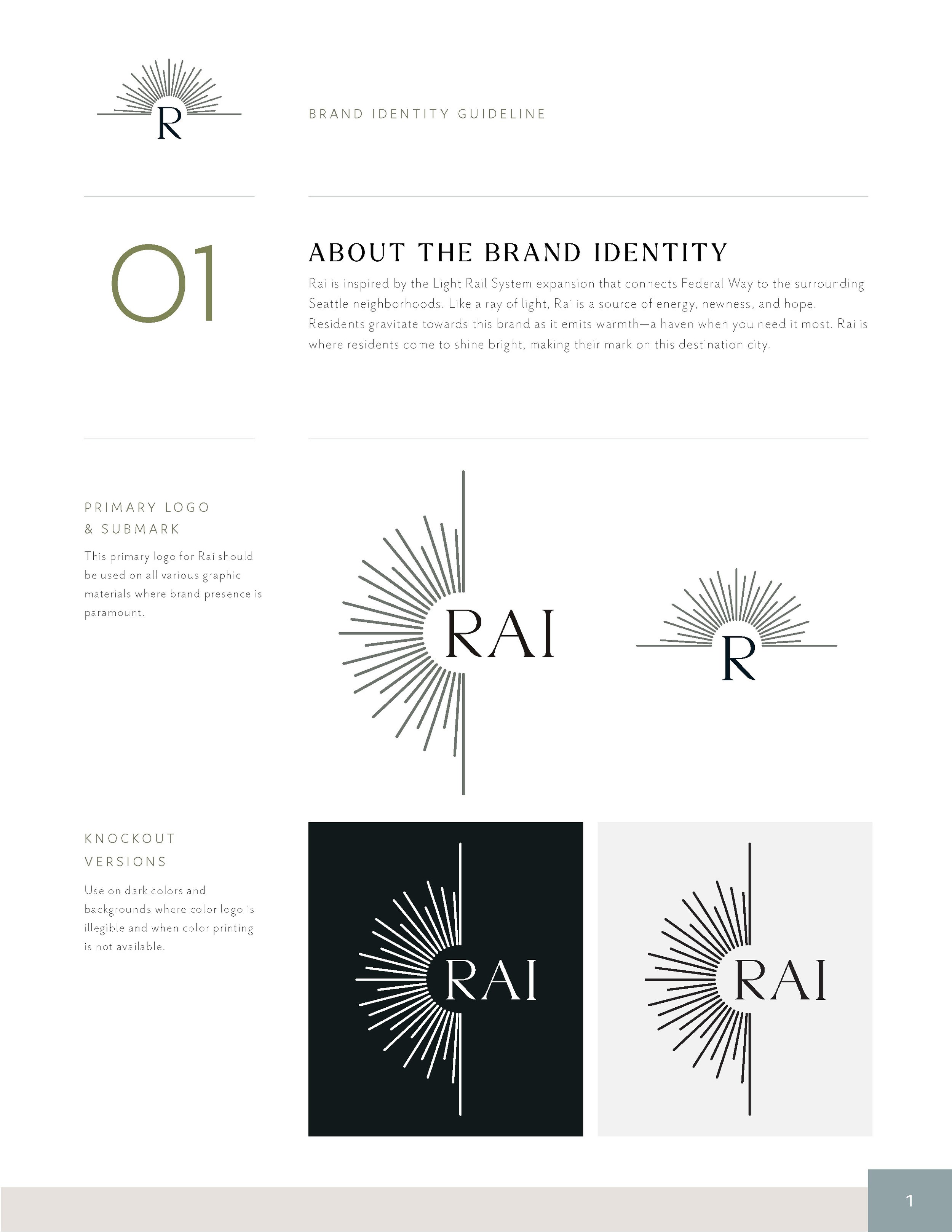
The RAI logo reflects the brand’s connection to the Light Rail System and its symbolic representation of light, movement, and hope.
Iconography: The logo features a clean, dynamic icon resembling a half sun of rays, subtly nodding to the rail system’s linear pathways and the idea of radiance.
Typography: Modern sans-serif typography was chosen for its simplicity and approachability, balancing urban energy with warmth and inclusivity.
Color Palette: Neutrals, blues and greens were used for warmth and connection to nature, while echoing the sleek urban feel of the Seattle area.
Brand Guidelines:
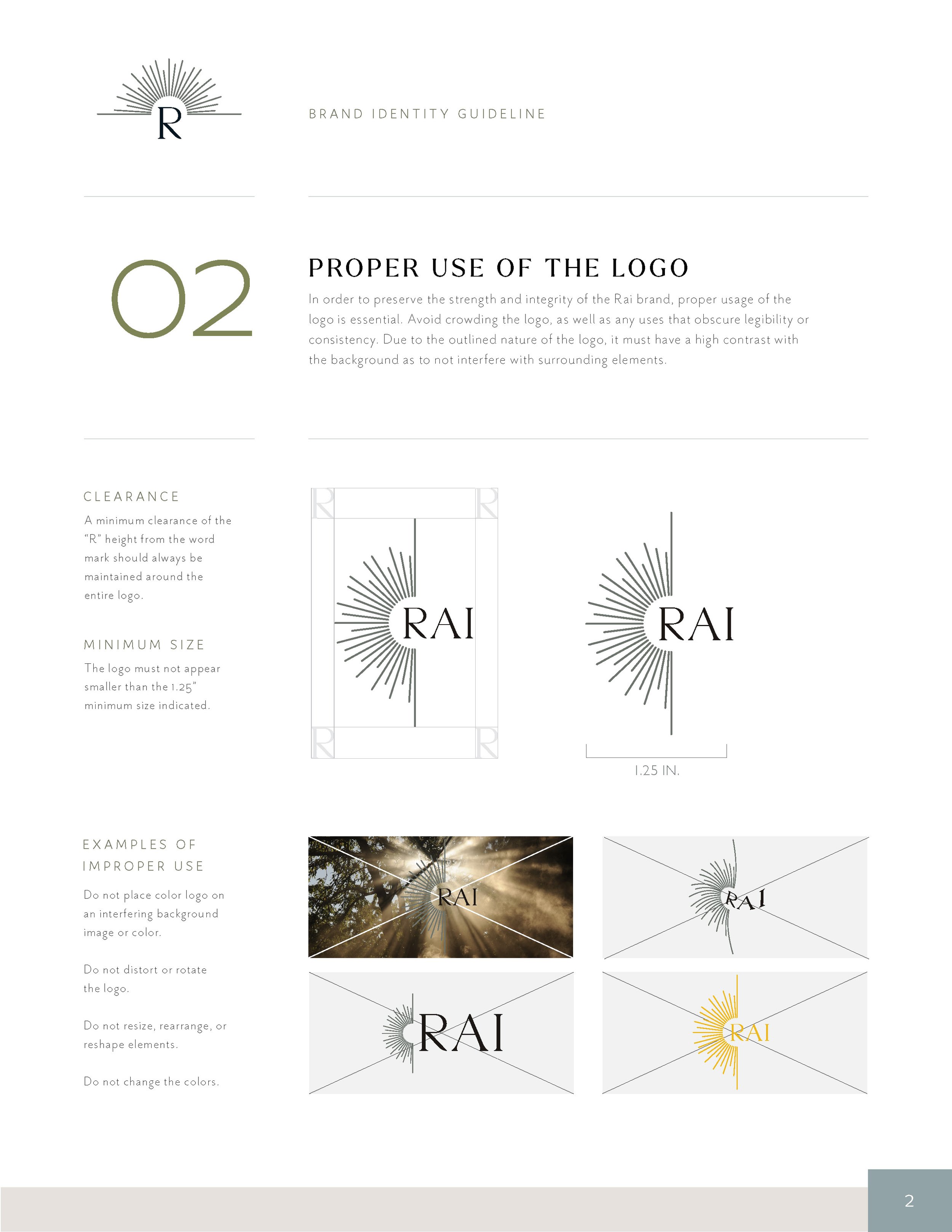
The brand guidelines ensure consistency across all touchpoints while maintaining the flexibility to adapt to various applications.
Core Elements: Detailed specifications for logo usage, color palette, typography, and graphic elements.
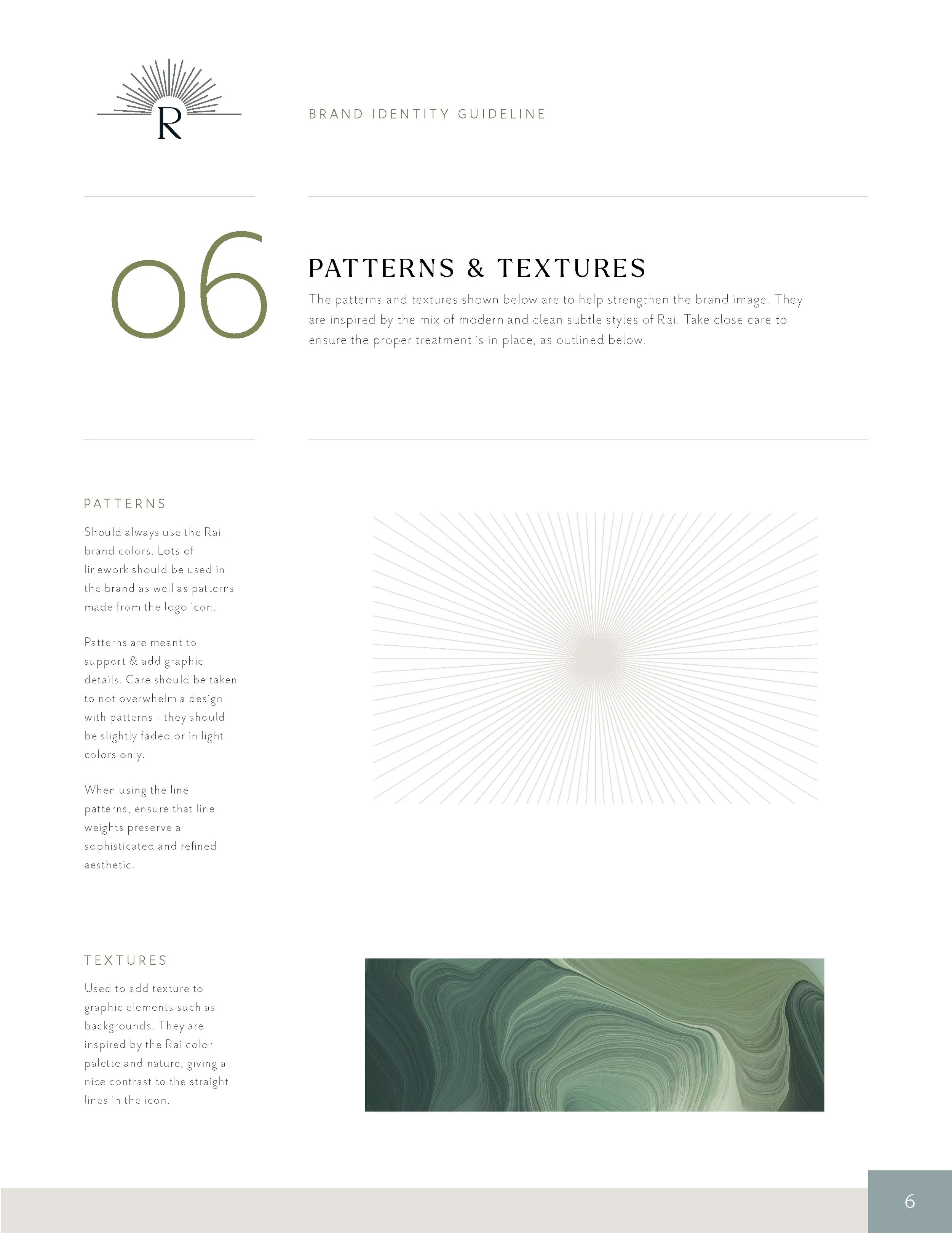
Visual Language: The use of diagonal lines, green textures, light-inspired patterns to convey motion, energy, and optimism, reflecting RAI’s connection to the rail system.
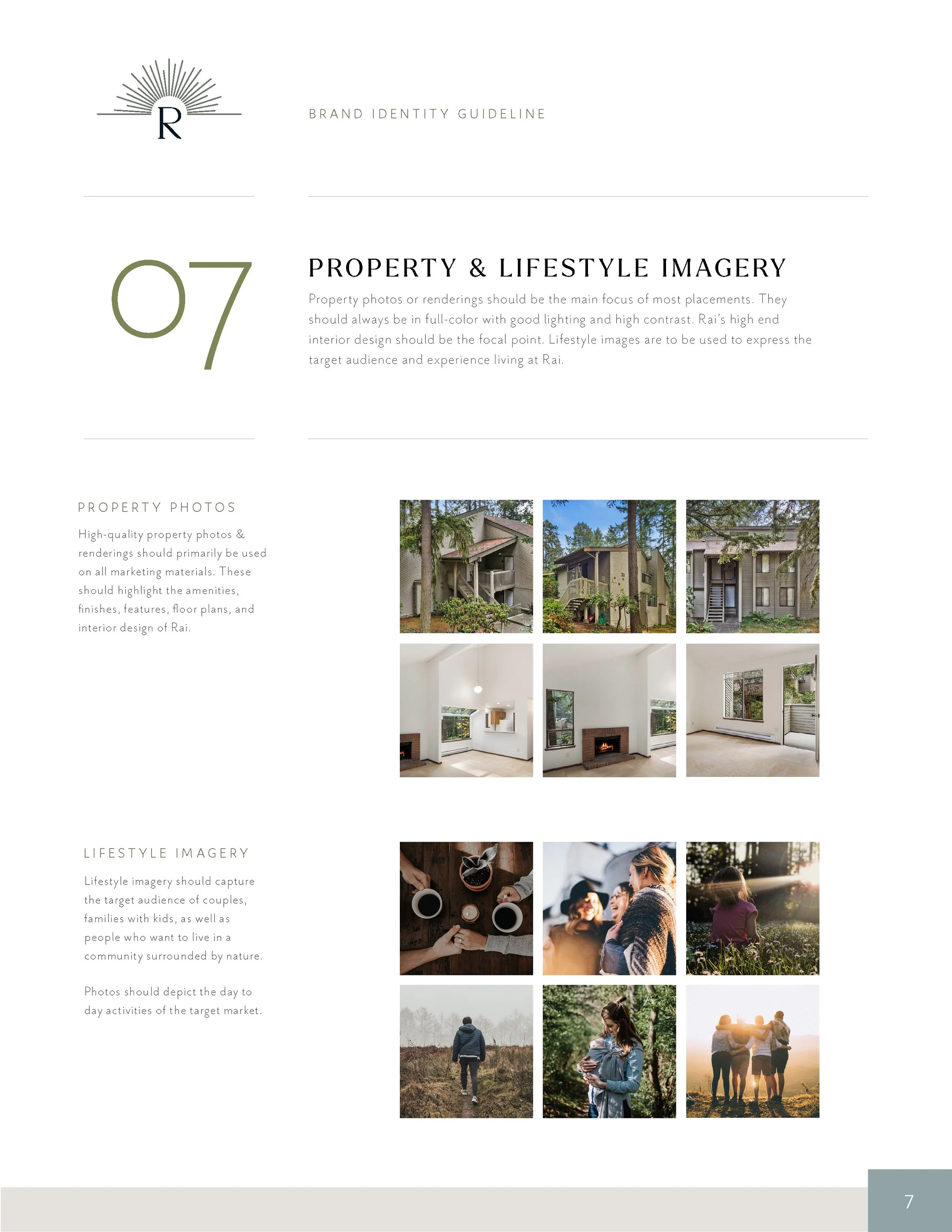
Imagery: A mix of vibrant, outdoor photography and warm, inviting visuals to balance urban excitement with the comfort of being close to nature.
Tone of Voice: Optimistic, welcoming, and dynamic, aligning with the brand’s mission to create a bright and connected living experience.
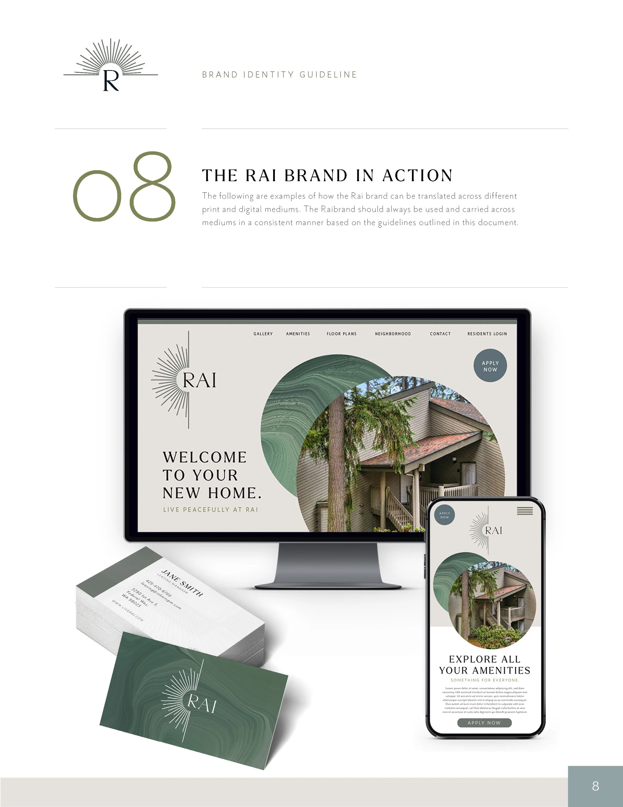
Stationery Design:
RAI’s stationery was designed to reinforce the brand identity and leave a lasting impression.
Business Cards: Minimalist yet bold, featuring the logo icon as a focal point on a green textured pattern. .
Letterhead and Envelopes: Simple and modern, incorporating subtle graphic elements inspired by the Light Rail’s pathways to create a cohesive, polished look.
Notecards: A versatile design showcasing the brand’s ray motif, providing a personal touch for communication with residents or partners.
Results
The RAI brand successfully captures the essence of its inspiration: light, movement, and connection. The cohesive visual identity, anchored by a dynamic logo and thoughtful stationery design, positions RAI as a vibrant and inviting residential brand.
Key Outcomes:
A striking and memorable logo that resonates with the target audience.
Brand guidelines that provide clear direction for consistent and effective communication.
Stationery that enhances RAI’s professional presence and reinforces its identity.
What I Loved About This Project
Designing for RAI was an inspiring challenge, blending the energy and motion of the Light Rail expansion with the warmth and comfort of home. I enjoyed crafting a brand that captures the optimism and connectivity of Seattle’s growing neighborhoods, creating an identity that feels both dynamic and grounded.