


Project Overview
MESO at Foundry City, located in the heart of St. Louis’ vibrant CORTEX innovation community, required a logo to represent its unique blend of historic charm, modern creativity, and community-driven innovation. The project focused on the branding for Phase 2: a residential development offering resort-like amenities and a lifestyle centered on connection, healthy living, and creativity. With no comparable product in St. Louis, MESO needed a logo that would stand out, convey its values, and resonate with its highly educated, innovative target audience.
Scope of Work
Logo Design
Brand Rationale & Storytelling
Challenges
Balancing historical significance with a modern, forward-thinking aesthetic.
Capturing the “center of city life” concept in a way that resonates with both local and innovative audiences.
Ensuring the logo’s adaptability for diverse applications, from signage to digital platforms.
Design Solutions
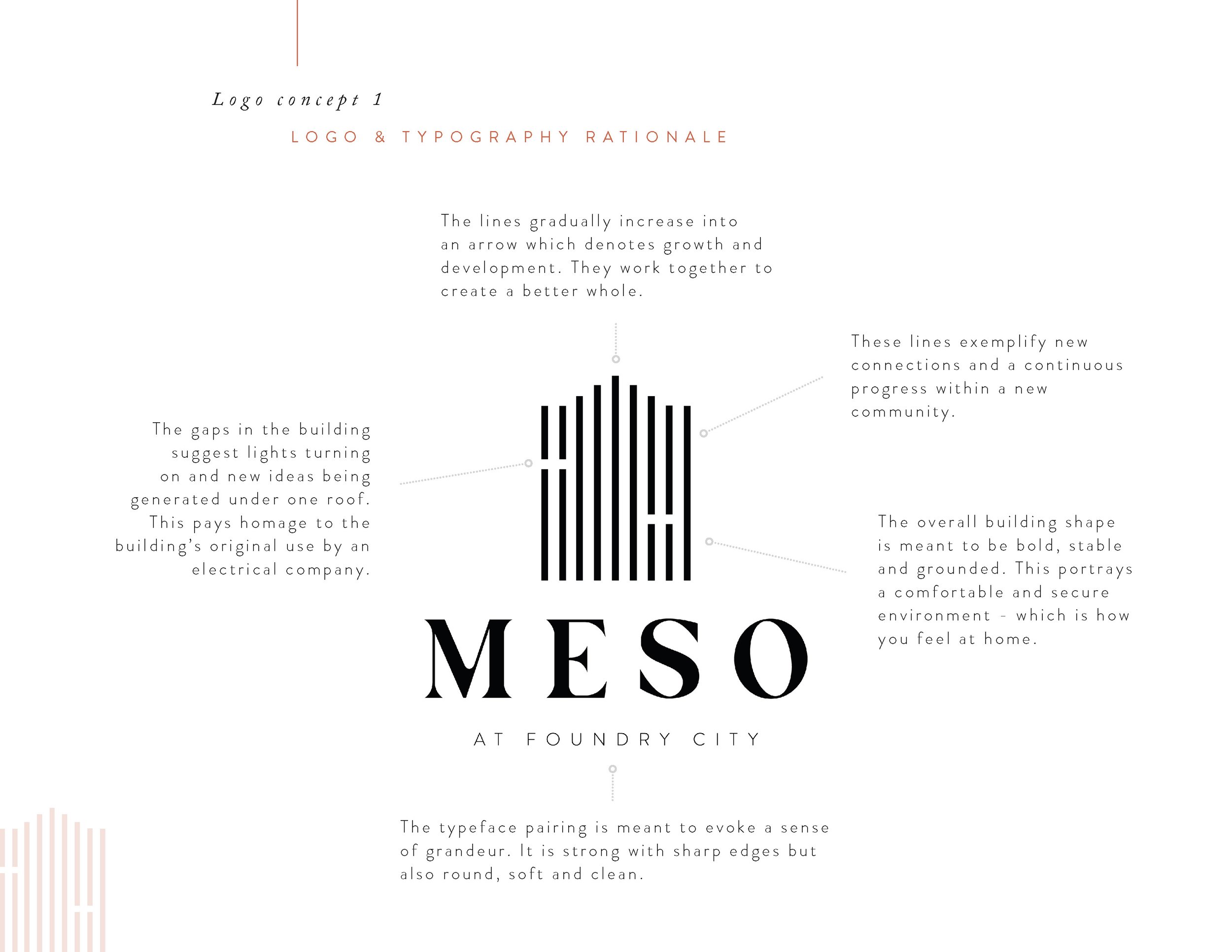
Logo Concept & Rationale:
The MESO logo encapsulates the spirit of “the center of city life” while paying homage to the development’s history and innovative future. The design incorporates:
Logo Symbolism: The lines gradually increase into an arrow at the top which denotes growth and development. They work together to create a better whole. These lines exemplify new connections and a continuous progress within a new community.
Typography: The typeface pairing is meant to evoke a sense of grandeur. It is strong with sharp edges but also round, soft and clean.
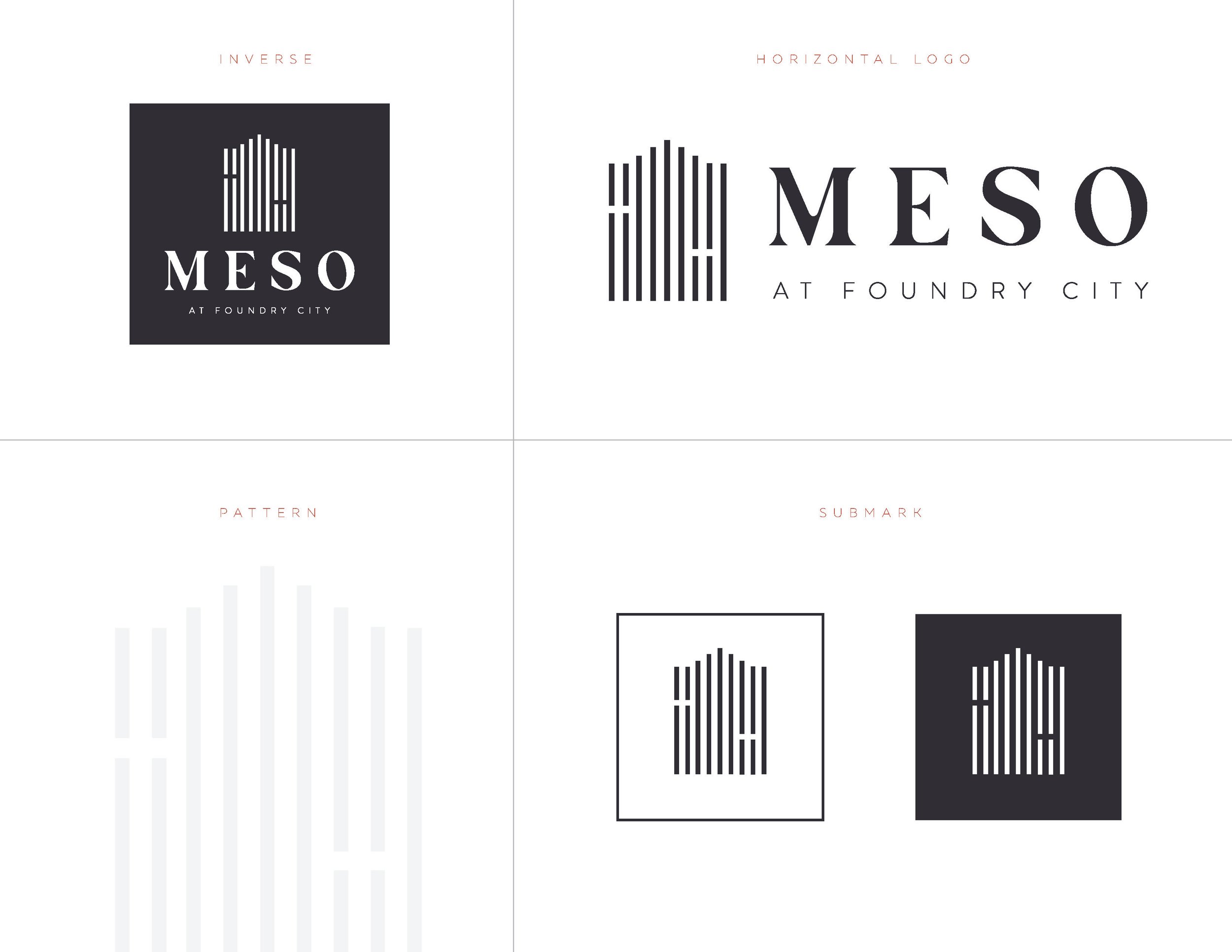
Black & White Palette: The monochromatic approach ensures timelessness and versatility while emphasizing the bold, impactful nature of the design. The lack of color ensures the logo remains adaptable for various applications, from signage to digital branding.
Subtle Storytelling Elements: The gaps in the building suggest lights turning on and new ideas being generated under one roof. This pays homage to the building’s original use by an electrical company. The overall building shape is meant to be bold, stable and grounded. This portrays a comfortable and secure environment, which is how you should feel at home.
Results
The final logo successfully embodies MESO’s identity as a creative and connected hub in St. Louis. It blends historical roots with modern innovation, appealing to the target audience’s values of creativity, education, and community.
Key Outcomes:
A bold, recognizable logo that reflects MESO’s centrality and innovative spirit.
Positive feedback from stakeholders on the logo’s versatility and storytelling elements.
A timeless design that aligns with both current and future phases of development.
What I Loved About This Project
Designing the MESO logo was an exciting challenge that allowed me to explore the intersection of history, innovation, and community. I enjoyed weaving elements of storytelling into the design, creating a logo that not only looks striking but also tells MESO’s unique story. It’s rewarding to see how a thoughtfully designed logo can capture the essence of a project and leave a lasting impact.