


Project Overview
Main & Maison is a modern heritage residential development in Vancouver, BC, designed for young professionals and growing families. Located just steps from the vibrant and trendy Main Street, this four-unit project features 2- and 3-bedroom homes that blend contemporary living with timeless charm. I was tasked with creating a cohesive branding package that captures the essence of the development’s modern-meets-heritage aesthetic while appealing to its target audience. The scope included logo design, brand guidelines, and site signage.
Scope of Work
Logo Design
Brand Guidelines
Site Signage Design
Challenges
Balancing modern and heritage design elements to appeal to the target audience.
Creating a logo and brand identity that felt timeless yet fresh.
Designing site signage that captured the brand’s aesthetic while remaining functional and visible in a busy urban setting.
Design Solutions
Logo Design & Rationale:
The Main & Maison logo reflects the development’s balance of modern and heritage design. The wordmark features clean, contemporary typography paired with subtle serif accents to evoke a sense of timeless sophistication. The ampersand acts as a unifying element, symbolizing connection and community, while the overall design is understated yet elegant, ensuring versatility across applications.
Brand Guidelines:
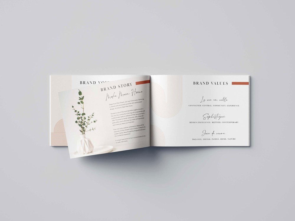
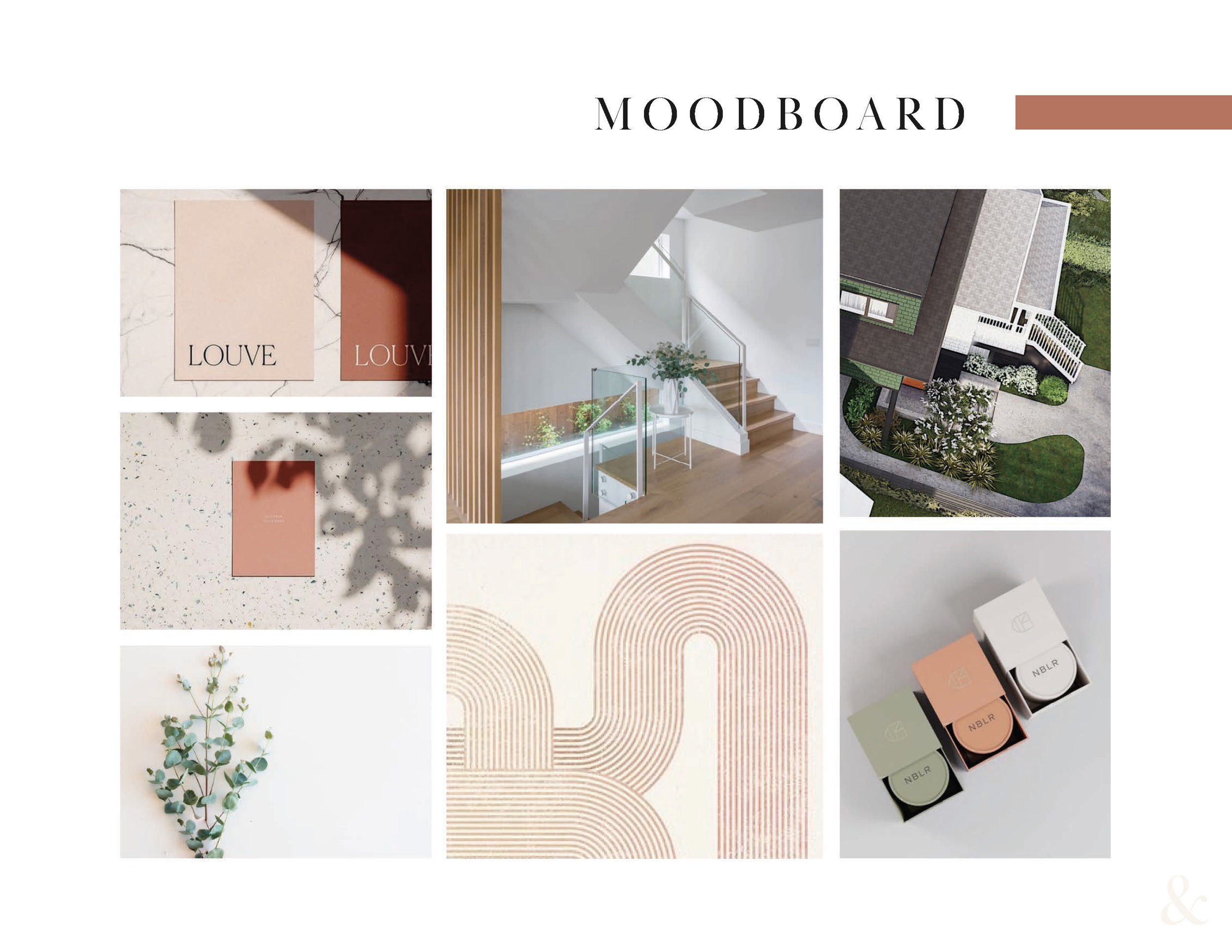
The brand guidelines establish a cohesive visual identity for Main & Maison, including typography, color palette, and design elements:
Typography: A combination of modern slab serif and script fonts creates a harmonious balance between contemporary and heritage aesthetics.
Color Palette: Neutral tones like soft cream, clay, and muted sage reflect the development’s sophisticated and inviting atmosphere, while accents of black add a touch of boldness.
Design Elements: Subtle linear patterns inspired by heritage architecture bring texture and depth to the brand’s visual identity, reinforcing the connection to the project’s historical roots.
Site Signage Design:
The site signage was designed to not only provide clear information but also to serve as a visual representation of the Main & Maison brand. Large, elegant typography ensures readability, while the signage’s clean lines and premium materials mirror the high-quality craftsmanship of the homes. The use of the brand’s muted color palette helps the signage blend seamlessly with the development’s surroundings while maintaining a professional and welcoming presence.
Results
The branding for Main & Maison successfully captured the development’s unique positioning and resonated with its audience of young professionals and families.
Key Outcomes:
A timeless and cohesive brand identity that reflects the modern heritage concept.
Increased interest and inquiries from prospective buyers, driven by strong visual branding.
Site signage that stands out while complementing the surrounding neighborhood.
What I Loved About This Project
Designing the branding for Main & Maison felt like weaving a story that bridges the past and future. I loved the creative challenge of capturing the development’s duality—modern vibrancy intertwined with heritage charm. Every element, from the elegant curves of the logo to the muted color palette, was part of a vision of community and connection. Seeing how the branding harmonized with the project’s architecture and brought a sense of belonging to life was both fulfilling and deeply inspiring.