


Project Overview
SÕL is a master-planned residential community of nearly 250 homes located in the rapidly growing Burquitlam area of West Coquitlam, BC. The development features two six-storey mass timber buildings, one market condominium and one purpose-built rental, making it Adera’s largest mass timber project to date.
I was tasked with designing the logo, comprehensive brand identity, stationery, and brand guidelines, along with exterior signage. The goal was to create a brand that reflects the deep connection to nature and West Coast living while offering a sense of comfort, security, and inspiration for residents.
Scope of Work
Logo Design
Brand Guidelines
Stationery Design
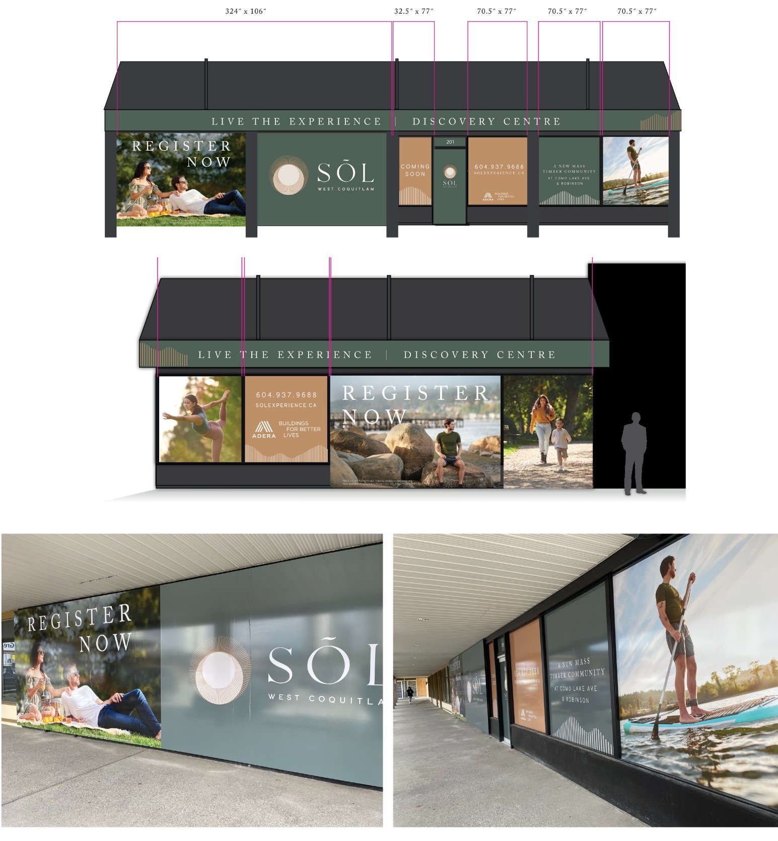
Exterior Signage
Challenges
Designing a brand that balances modern West Coast aesthetics with the comforting, grounded tone required for a residential community.
Ensuring the logo and identity resonate with a diverse audience, including families, downsizers, and nature enthusiasts.
Creating signage that harmonizes with the architectural elements of the mass timber buildings while remaining functional and eye-catching.
Design Solutions
Logo Design:
The SÕL logo was designed to embody the tranquil, nature-inspired ethos of the brand. The typography is clean, modern, and approachable, with subtle organic curves to evoke a connection to the surrounding natural environment. The circular accent above the “O” in SÕL represents the sun, tying into the brand’s themes of reflection, growth, and connection to the outdoors.
Brand Identity:
The brand identity reflects the essence of the West Coast lifestyle, offering a sense of grounded comfort while inspiring moments of reflection and discovery.
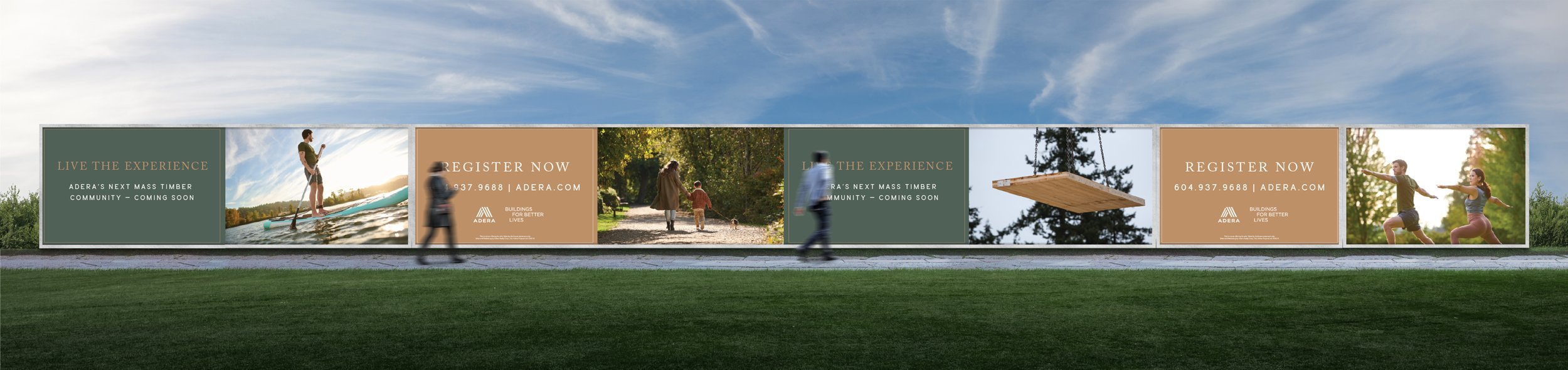
Color Palette: A natural, earthy palette with neutrals, greens, and yellow evokes the beauty of the forest, the ocean, and golden hour.
Typography: A modern sans-serif typeface paired with serif headings for a balance of sophistication and approachability.
Imagery: Photography and graphic elements focus on serene outdoor moments—like sunlight filtering through trees, paddles dipping into water, and families enjoying tranquil walks—tying into the brand’s themes of connection and reflection.
Stationery Design:
Custom-designed stationery, including business cards, letterheads, and envelopes, seamlessly integrates the brand’s color palette and logo, ensuring a professional and consistent presence across all touchpoints.
Exterior Signage:
The exterior signage was designed to reflect the development’s natural aesthetic and modern architecture.
Materials: Woodgrain finishes and brushed metals were used to complement the mass timber design of the buildings.
Design: The signage incorporates clean lines and the SÕL logo, ensuring visibility and alignment with the brand identity.
Placement: Thoughtfully positioned to guide residents and visitors while enhancing the overall environment.
Results
The SÕL brand successfully captures the essence of West Coast living, offering residents a sense of tranquility and inspiration while connecting them to their natural surroundings. The cohesive design across logo, identity, and signage enhances the community’s appeal and reflects the innovative mass timber construction.
Key Outcomes:
A logo and brand identity that evoke comfort, reflection, and a deep connection to nature.
Exterior signage that integrates seamlessly with the architecture, enhancing the overall environment.
Positive feedback from prospective buyers and renters for the inviting and inspiring aesthetic.
What I Loved About This Project
This project was a unique opportunity to craft a brand that celebrates the beauty and serenity of West Coast living. I especially enjoyed developing the visual identity and logo to reflect the moments of reflection and connection that SÕL embodies. Seeing how the branding came to life through the signage and other applications was very rewarding.