

Project Overview
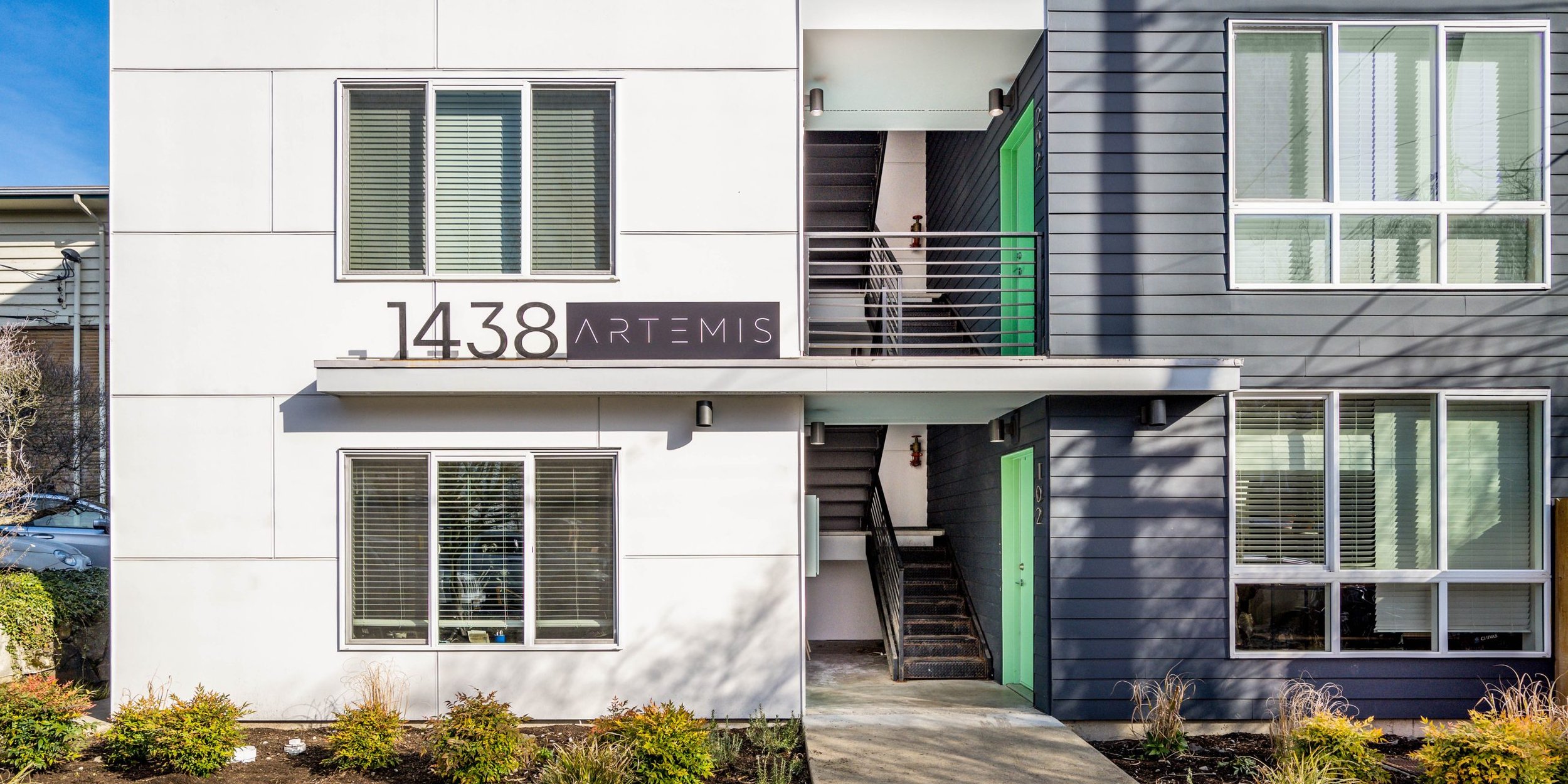
Artemis is a boutique apartment community nestled in the vibrant Ballard neighborhood of Seattle, WA. This development offers residents a unique lifestyle with easy access to popular restaurants, bars, breweries, bike trails, and natural beauty. Aiming to attract young professionals and those seeking a blend of urban living and outdoor adventure, Artemis required a cohesive brand identity that reflects the essence of its community and location.
I was tasked with creating the logo, brand guidelines, and landing page design, bringing the spirit of Ballard to life through a refined and approachable visual language.
Scope of Work
Logo Design
Brand Guidelines
Landing Page Design
Challenges
Reflecting Ballard’s urban-meets-nature vibe while maintaining a boutique feel.
Designing a logo and brand identity that stands out in Seattle’s competitive housing market.
Creating a landing page that highlights both the lifestyle and community amenities effectively.
Design Solutions
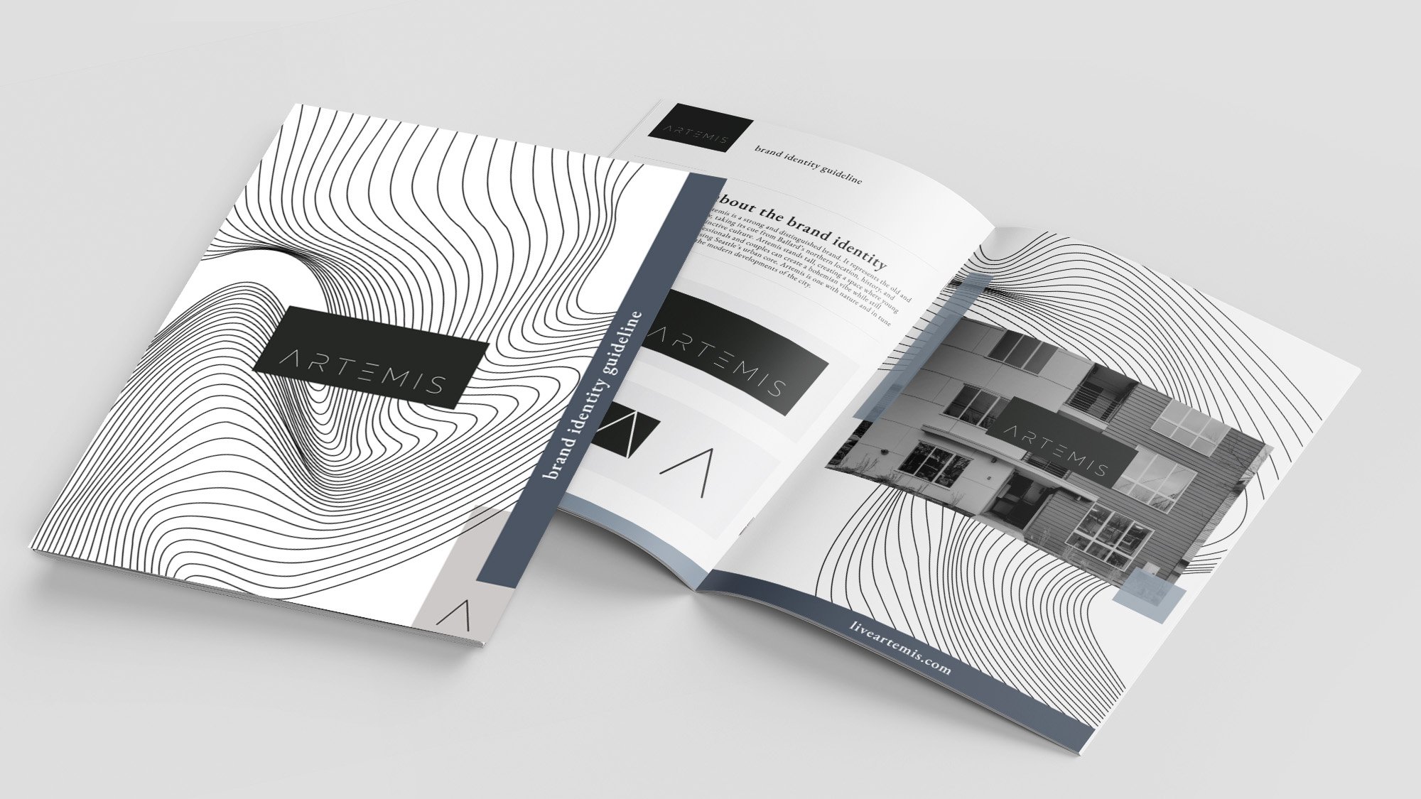
Logo Design:
The Artemis logo encapsulates the community’s boutique charm and connection to nature while maintaining a modern, urban feel.
Typography: Clean, minimal word mark with minimalistic design evokes a sense of sophistication and approachability.
Brand Guidelines:
The brand guidelines ensure consistency across all applications while resonating with the target audience.
Color Palette:
Muted blues to reflect Seattle’s natural beauty and tie into the outdoor lifestyle.
Neutral tones to add warmth and balance, reflecting the inviting boutique charm of the community.
Typography System:
A clean sans-serif for headers and body text ensures readability across digital and print formats and emphasizes elegance and a boutique aesthetic.
Graphic Elements:
Organic lines and soft textures were developed to mimic the fluidity of nature, adding depth and visual interest.
Landing Page Design:
The Artemis landing page was crafted to engage potential residents and showcase the community’s unique lifestyle.
User-Friendly Layout: The design ensures easy navigation, with clear sections for amenities, the gallery, floor plans and location highlights.
Visual Storytelling: High-quality imagery and engaging content convey the boutique charm and proximity to Ballard’s vibrant culture and nature.
Call-to-Action: Prominent buttons guide users to explore floor plans, apply now, or contact the leasing team.
Results
The Artemis branding successfully captures the essence of Ballard living, appealing to young professionals and urban adventurers alike. The cohesive visual identity and engaging landing page have elevated Artemis’ position in the boutique apartment market.
Key Outcomes:
A distinctive logo and brand identity that resonate with Artemis’ target audience.
A visually appealing and intuitive landing page that effectively converts leads into prospective residents.
Enhanced brand recognition, fostering a strong connection between Artemis and the Ballard community.
What I Loved About This Project
Designing for Artemis allowed me to balance urban sophistication with natural charm, creating a brand that feels both modern and inviting. I particularly enjoyed drawing inspiration from Ballard’s vibrant culture and outdoor beauty to craft a logo and visual identity that reflects the community’s spirit. Seeing how the brand and landing page came together to elevate Artemis’ presence in the market was creatively fulfilling.